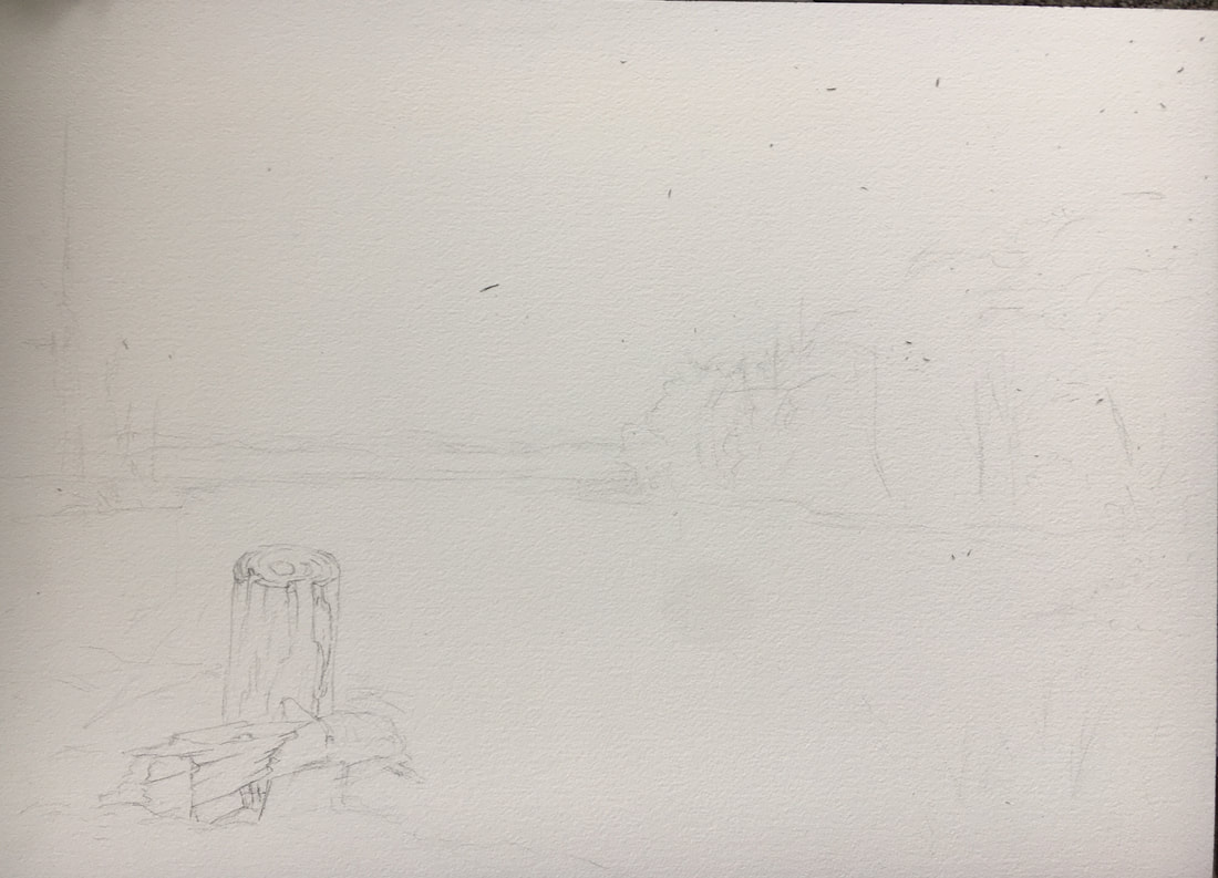
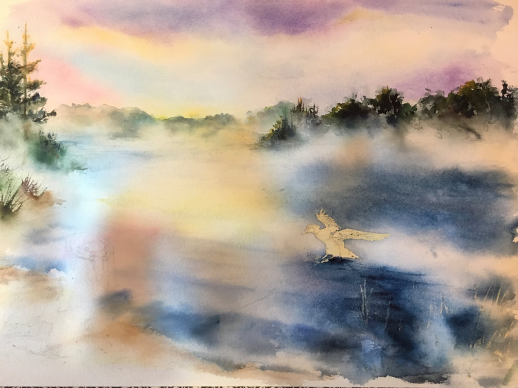
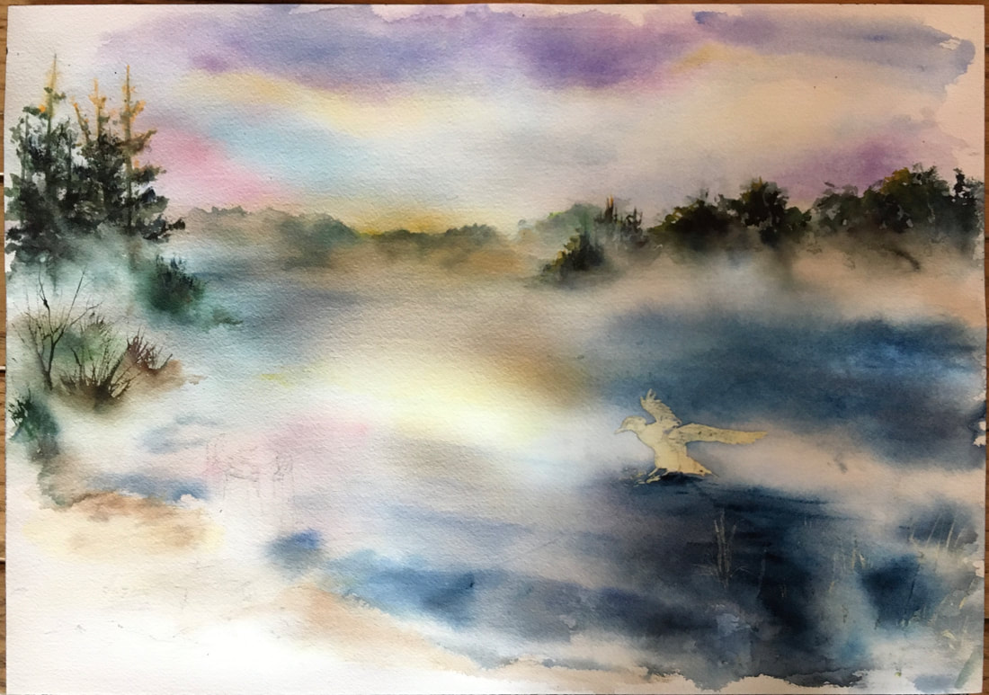
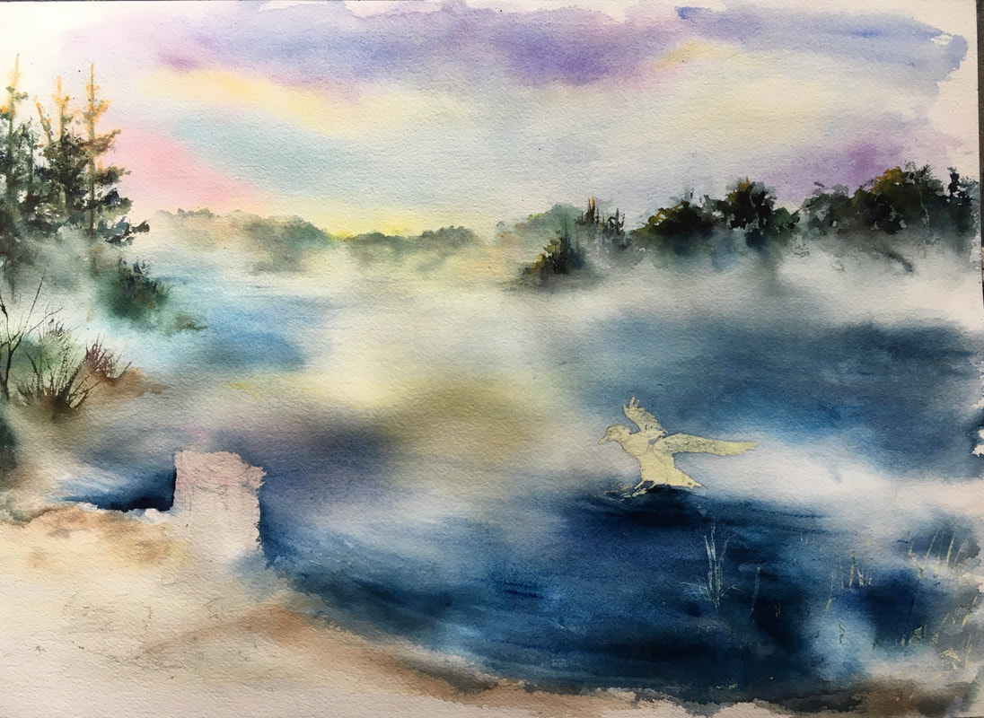
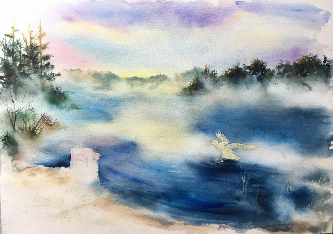
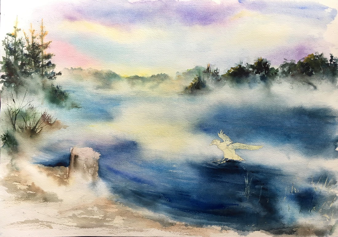
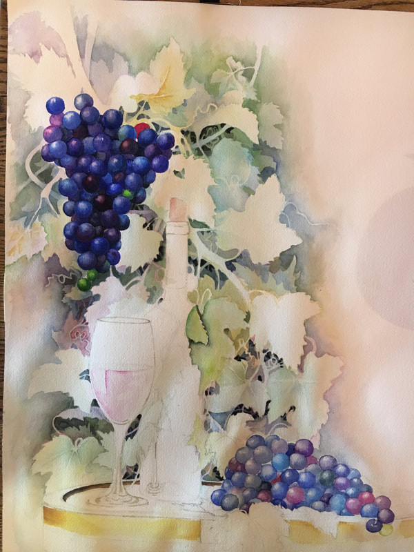
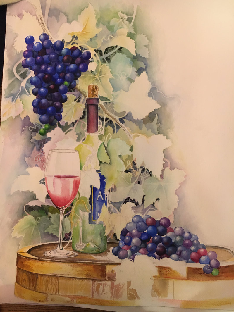
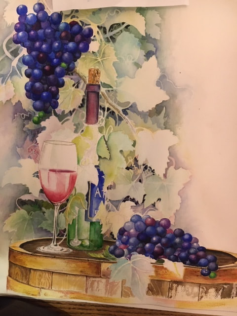
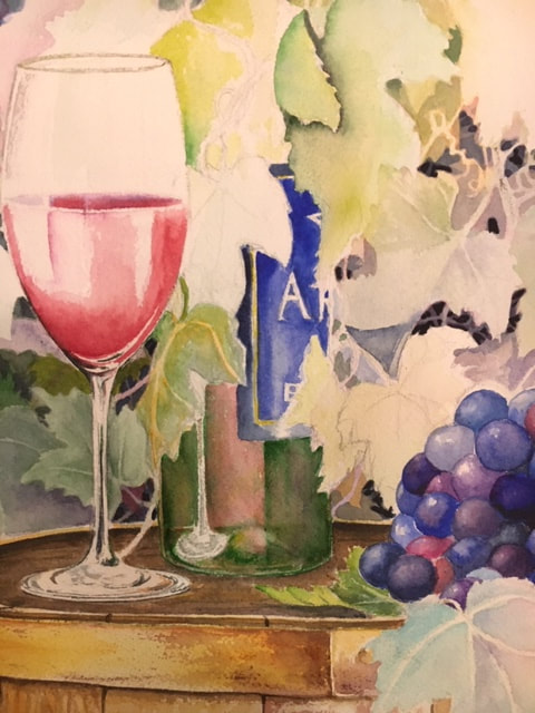
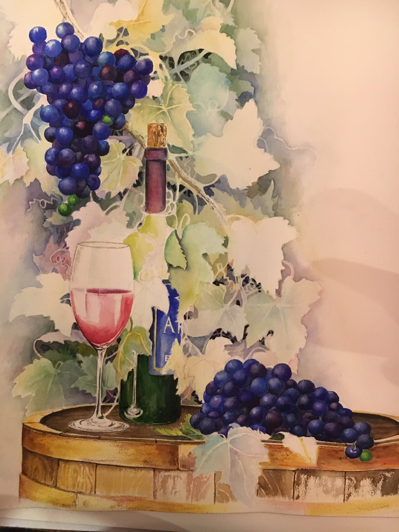
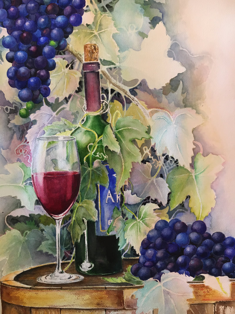
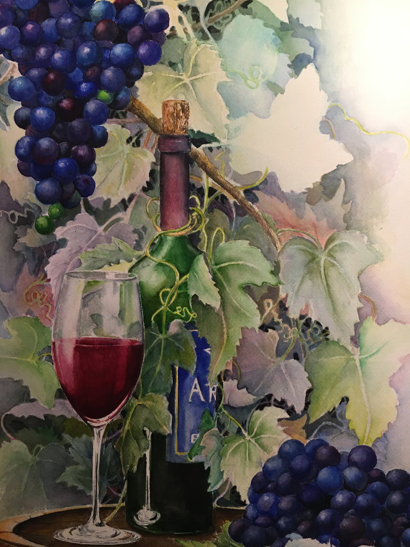
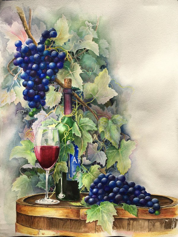
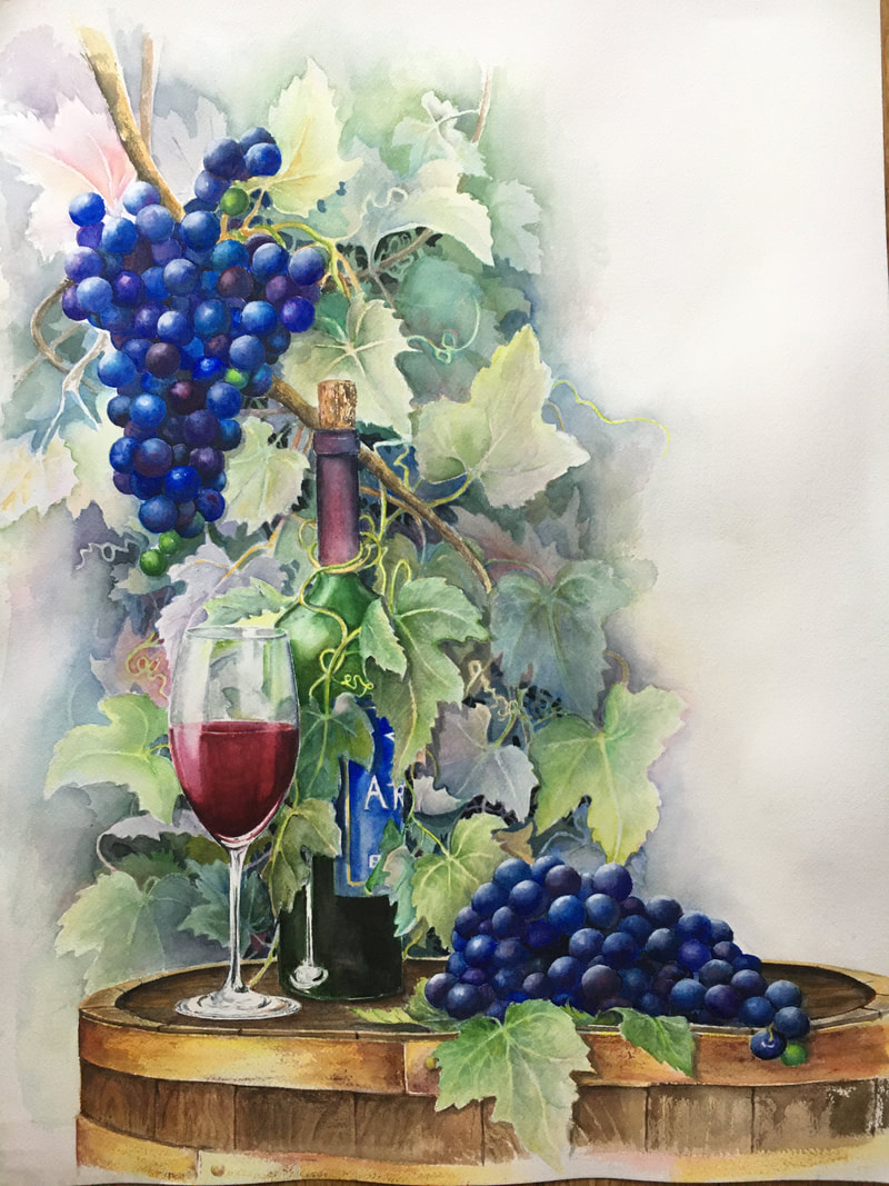
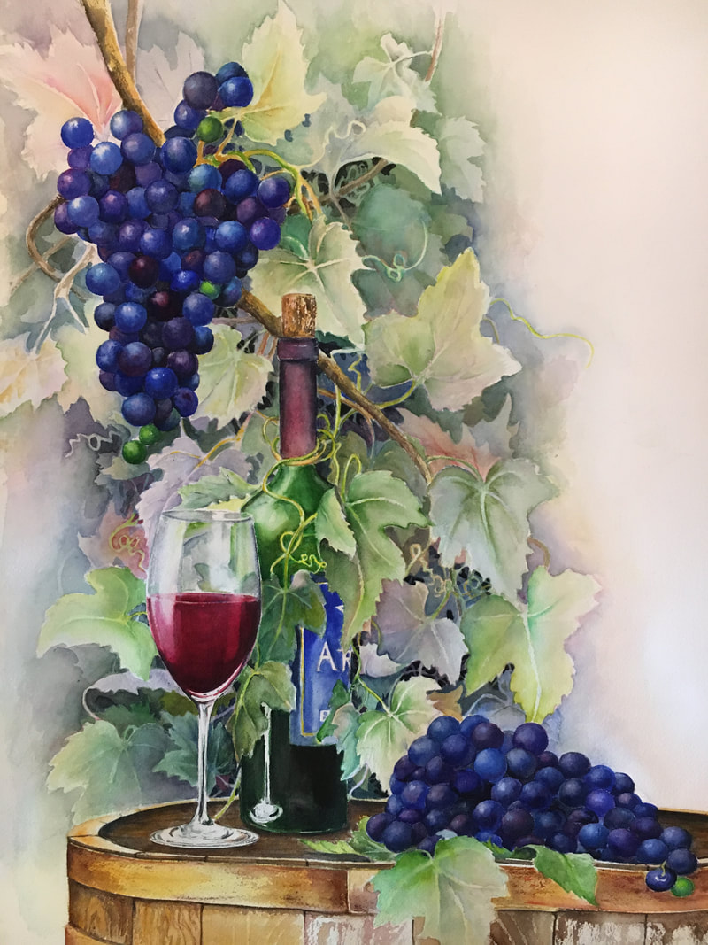
I've started a new grape composition and decided to post the progress as I go. The background is done with the negative painting which I love for the grape leaves. I'm working with an asymmetrical layout which I also like to use. It creates a nice contrast between the painted areas, and the mostly un-painted areas. 
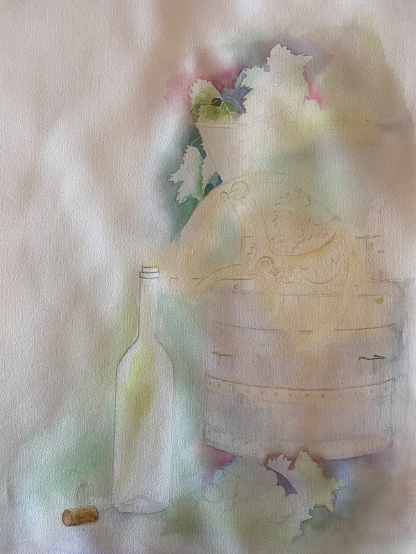
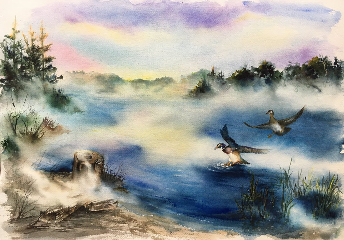
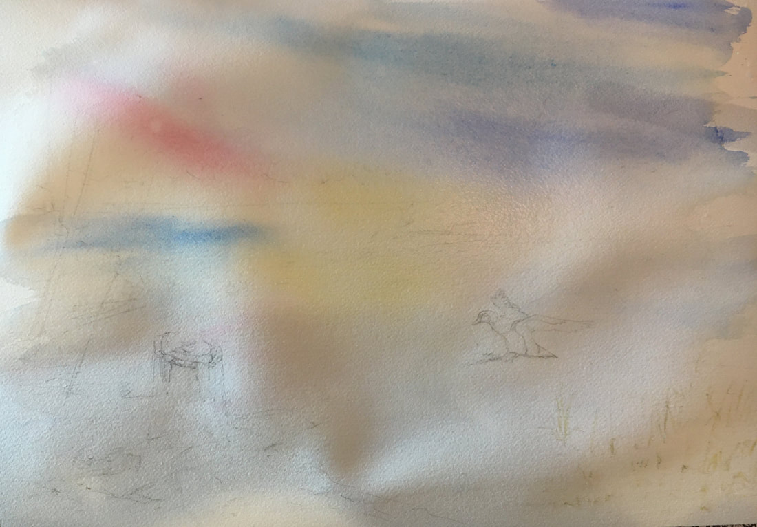
Just some faint glazes of color above to give a backdrop for the various elements I wanted to include in this. 
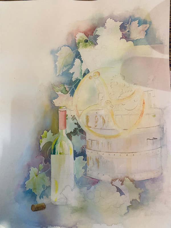
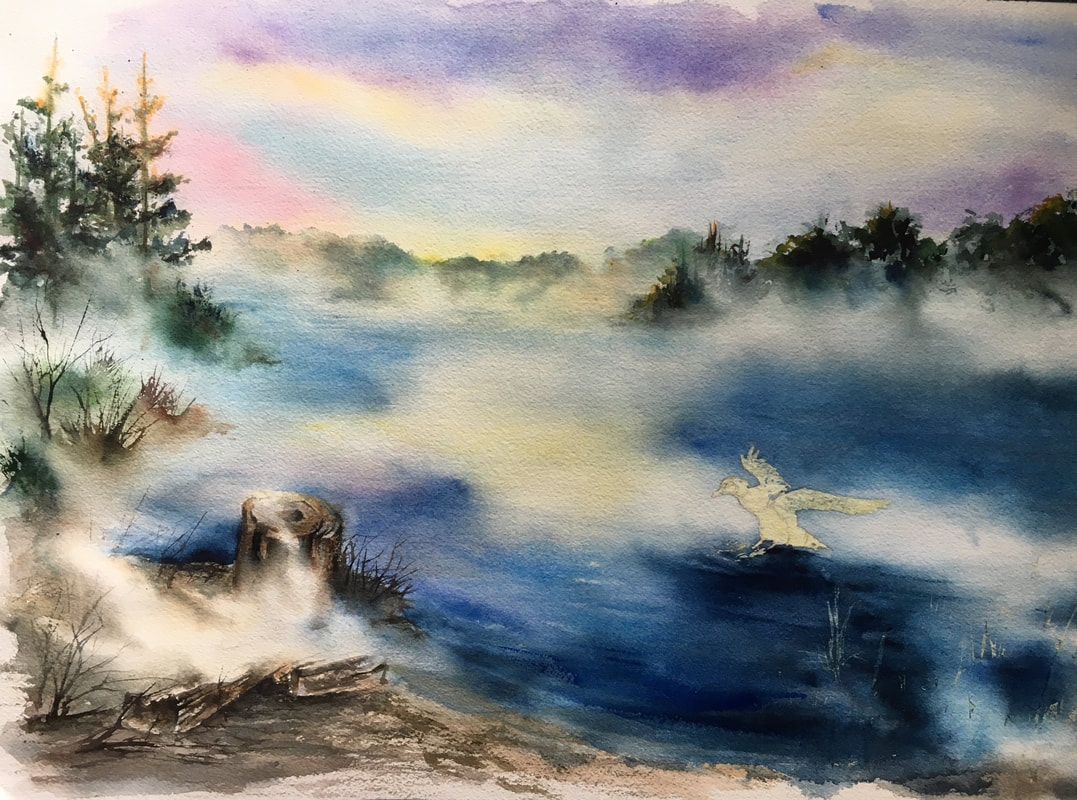
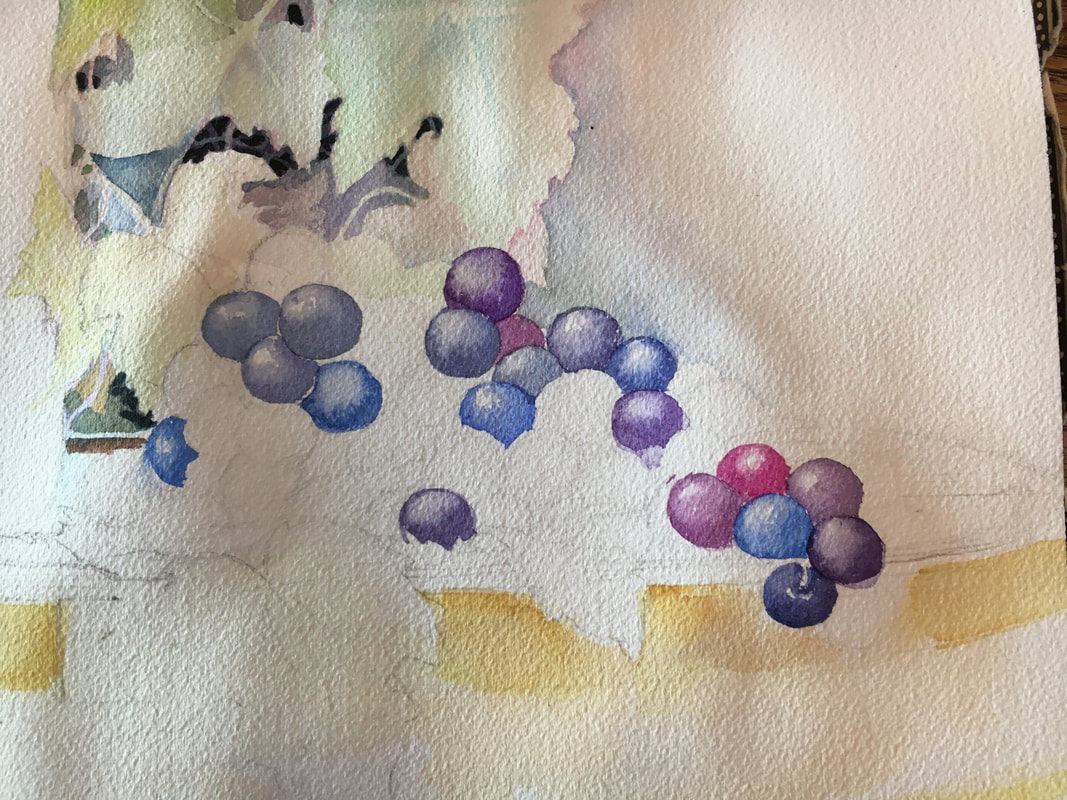
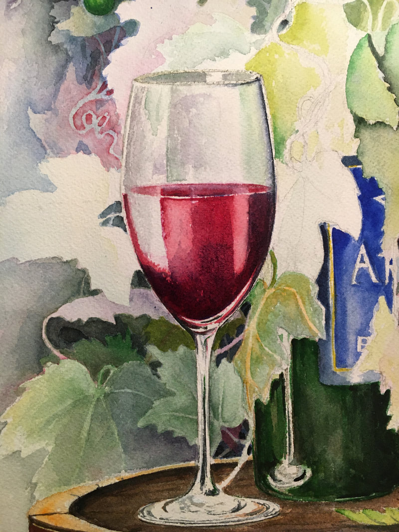
Here I've added in several layers and started to define my leaves, added first washes on the bottle and some background colors for the wine press. I'm working to use the leaves as a visual guide to draw your eye around the composition in this piece. 
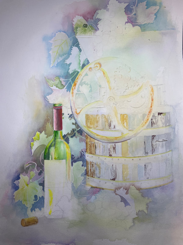
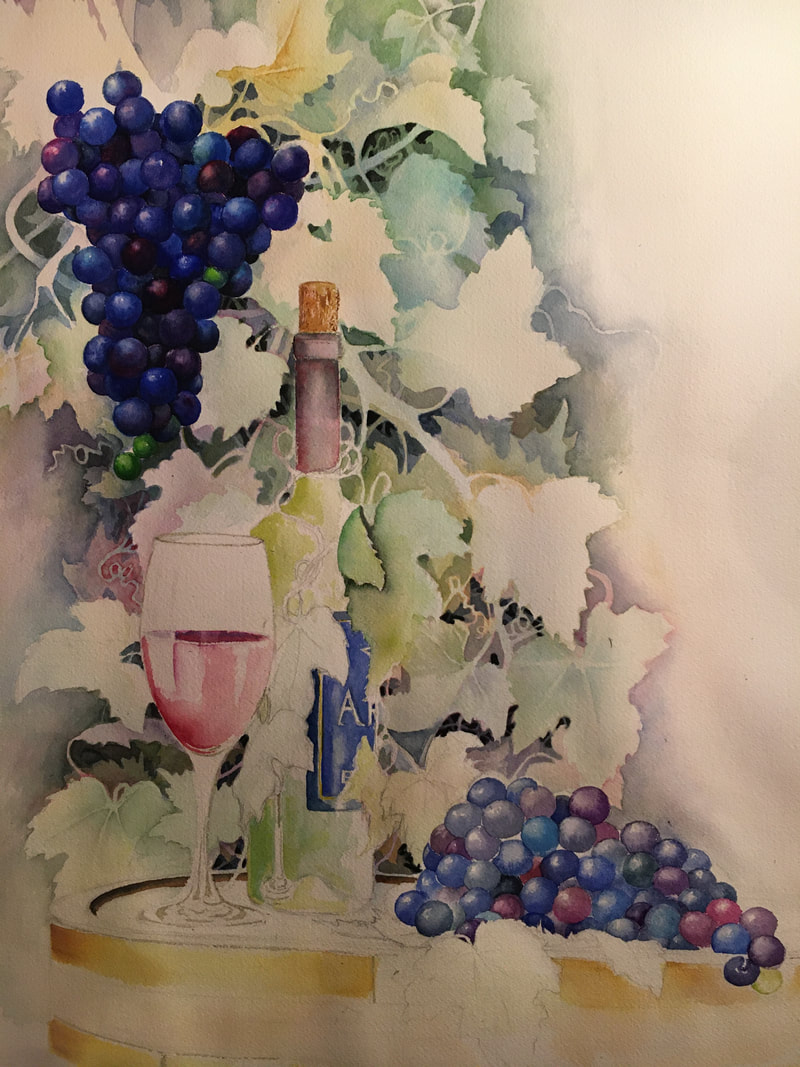
More values in the leaves, starting to define the bottle and adding texture to the press. I want to keep an eye on the comparative values and hues around the composition so I tend to jump around as I'm painting. 
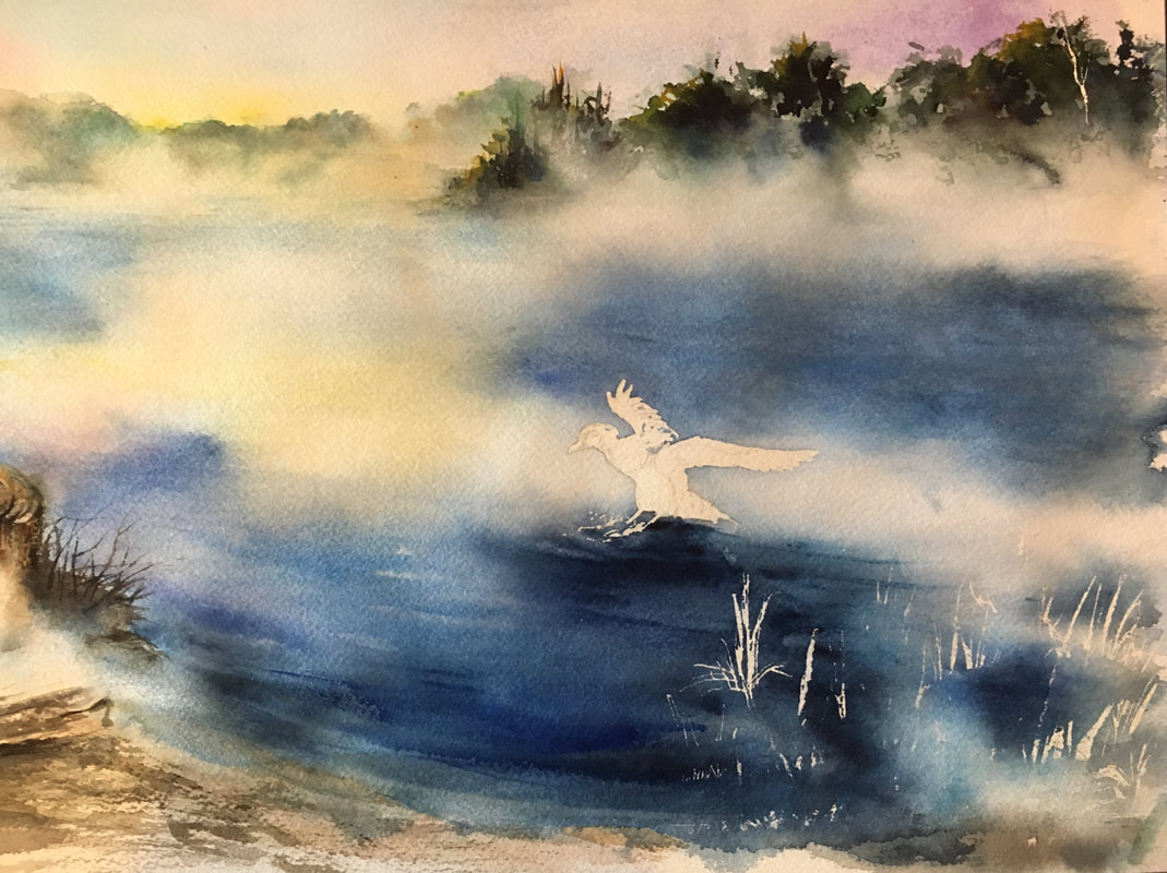
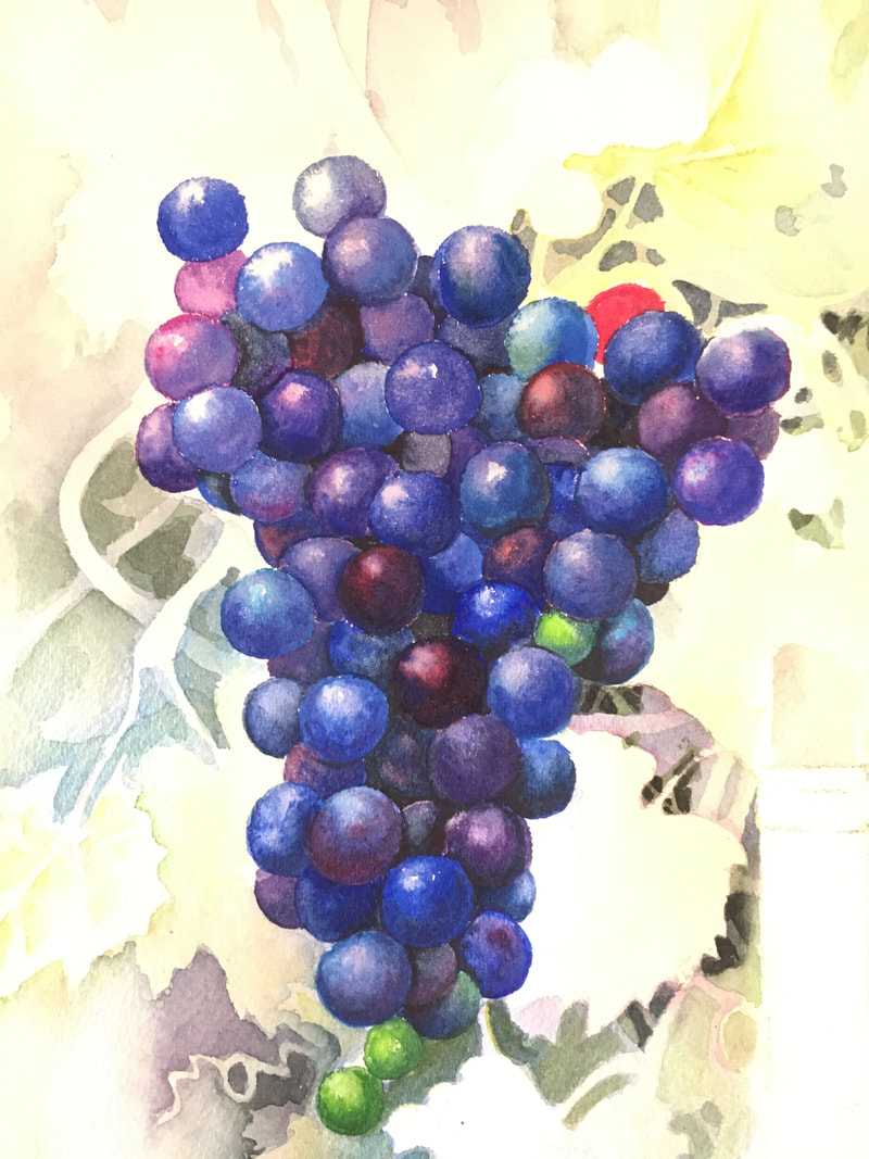
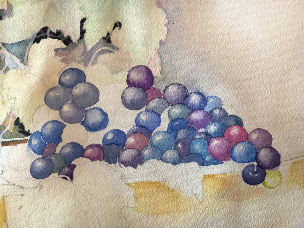
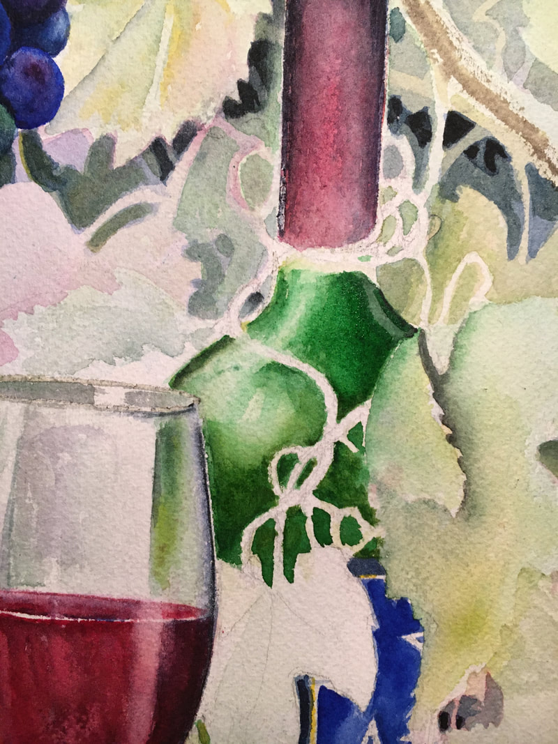
,Adding in my base grape colors, which if you looked at an earlier grape composition, may change to a entirely different color by the end. More texture in the wood and darker values defining the leaves. 
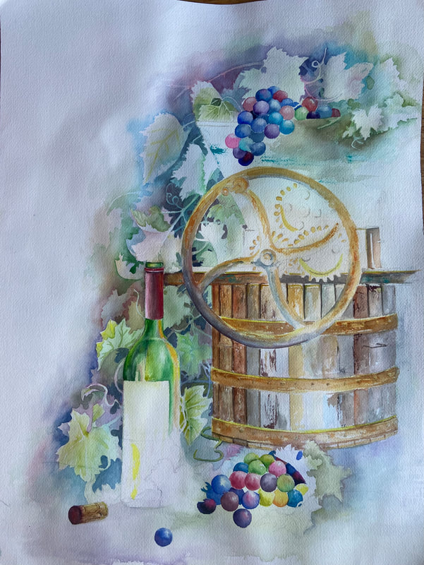
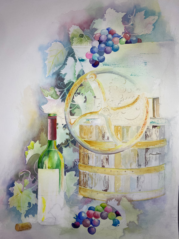
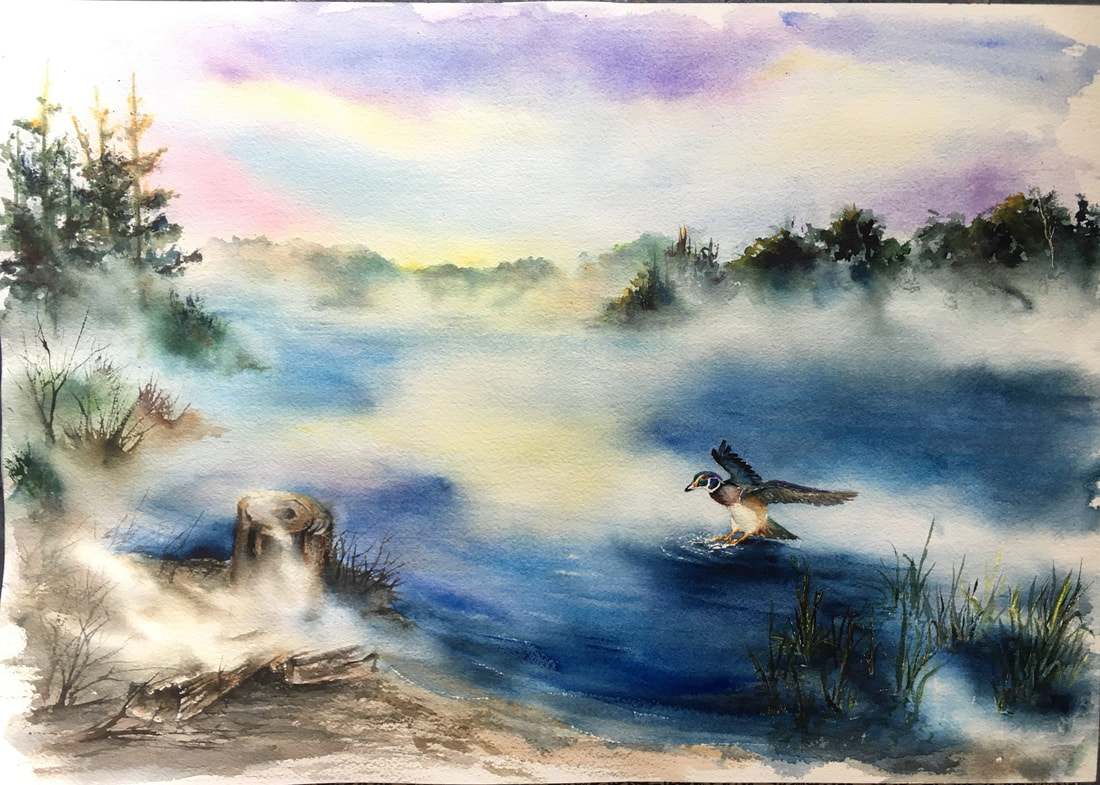
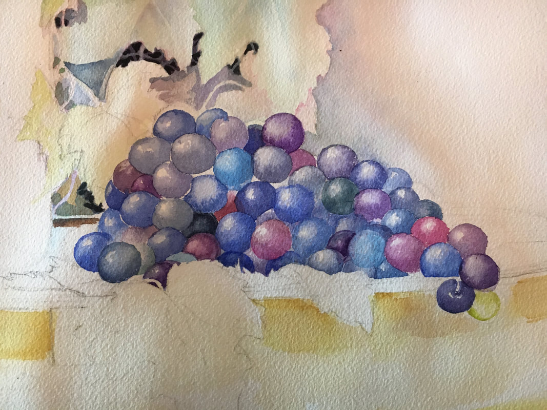
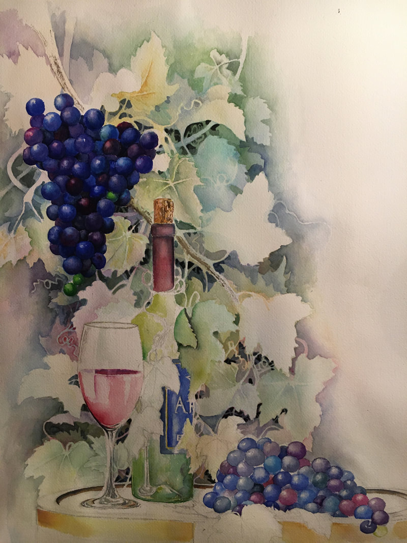
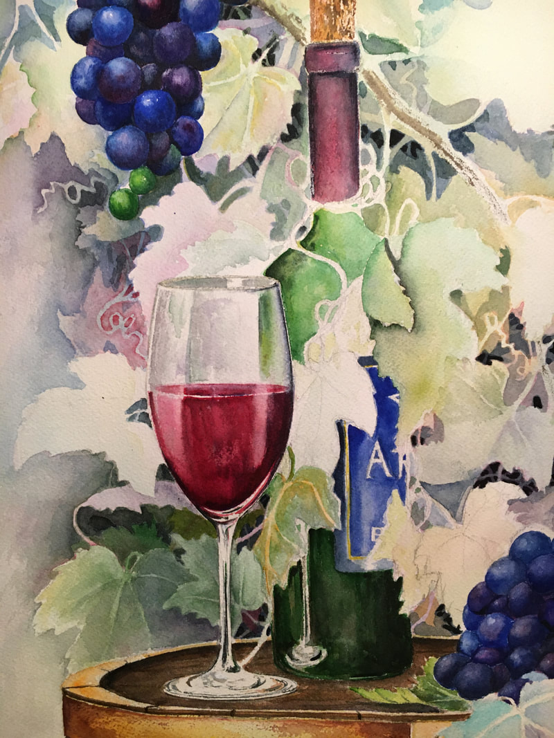
Made a big jump here lol, got into painting and forgot I was going to take pictures. 😂 I Added more leaves and darker areas between them to start to define additional leaves and vines. I'm slowly curling the leaves around the bottle and press to draw your eye along that path. I also went back and added more hue to the press and wheel. Not totally decided on the overall color of the wood, torn between the cooler colors I used in the pencil drawing and the warmer tones I've started here.m I also defined some of the veins in the individual leaves. Oh yea, more fun with the cork and bottle. 😁 I want to make sure I pick up reflections of the press and metal on the bottle.
0 Comments
Long ago in a world far far away we started practicing painting mist. When the collage was shut down due to the pandemic I suggested to those who opted for online classes to again try a painting with mist. Unfortunately I was stuck in the fight or flight mode due to COVID induced anxiety which resulted in a creativity slump. Fast forward 4 months and I'm happy to say with the help of a friend who mentally slapped me around I got out of my funk and altered a painting I had in progress to complete the following. This was originally going to be a painting of Halfmoon Lake off the Potawatomi trail in the Pinckney rec. area in the fall. My intent was to highlight the stump in the bottom left, have a colorful sky and fall foliage in the tree line. This was started mid March right after schools were closed. I had added in some background washes of color then hit a brick wall as I stressed. Fortunately for me I got my mojo back and picked up the brush again. My first washes had dried light and I was able to add more hues when altering the design in July. The decision was to use my basic design with mist on the lake, change the season to summer and add a wood duck. Below you can see I built up the hues in the background. It took a couple of tries, new washes over dry, to achieve what I wanted. Once I had the basic background I started on the furthest tree line with colors that I would use throughout the composition. To add in some visual interest I started with the oranges, pinks, greens, and purples in a light wash, flowing them into water to create the mist effect. More greens for summer were added on top after the first wash had dried after re-dampening where I wanted the mist to be. You can create the mist effect by using a brush that has a lot of paint and water in it and letting the paint crawl into areas that you have dampened with water. More water is attracted to areas of less water. After the horizon was dry I added in the beginning of the second tree-line and the trees in the mid-ground wetting beneath them to encourage the paint to crawl into the damp areas. A little tilting and rolling of the paper helped created the flowing mist tendrils. I added in more trees to the right and left, laying down some base hues while the paper was damp, then added a little yellow orange for the sun catching the tops of the trees on the left. After that area had dried I used a rigger to add in the brush below and the branches/brush in the background in a lighter value adding clean water at the bottom to fade it into mist. A sponge was used on top after the paint dried to add texture and depth to the trees and bushes in the back. The tree-line on the right also got some sponging to add a feeling of depth to the foliage and the duck was masked to preserve the white areas. Turning my attention to the foreground, some base colors, Winsor brown and quinacridone gold were added in a light wash. It occurred to me that if I wanted the mist to really show up on the water I would have to use deeper values/hues than I had originally planned. With that is mind I used Ultramarine Blue, Indigo, Indanthrene Blue, and a little Cobalt Blue to achieve the darker values. I flooded the area several times with water adding in more paint each time to darken my values and create the mist. Darker areas were added under the duck along with bands of blue that paralleled the shoreline like waves coming in. It took a couple of applications of the blues to achieve the depth of color I wanted as the watercolor lightens as it dries. I made sure during this that the areas I wanted mist in were damp with clean water and I did not actively paint into them. The darker hues were added around the damp areas and the paper was tilted to encourage a flow of paint into the edges of the "white" areas. I spritzed a little clean water onto my paint to add subtle texture to those areas. The "thirsty brush" technique, were a damp brush is dragged through wet painted so it acts like a sponge and picks up paint, was used to create the light edges of the waves as they approached the shoreline. Re-thinking the design I decided the stump would compete with the duck if painted it as I originally intended. To alleviate that conflict I decided to add some mist over it. Some dry brushing in the foreground is the start to the shoreline texture. More dry brushing with details on the stump and log are added in using Sepia, paynes grey, and a warm brown. Twigs and sticks are added with the rigger being careful to lighten the value as they go back into the composition. I removed my mask 😳 always a shock, found I had forgotten about the reed masking I originally thought I'd like and spent some time layering over the reeds to tone them down. The wood duck was put in with a #2 pointed round brush, with Caput Mortuum Violet on the breast. Indigo, Paynes grey, Sepia, Transparent Umber were used on the wings and body. The head was a combination of Cadmium Red Deep, Green Gold, a touch of Helio Green, New Gamboge, and a purple made of Ultramarine Blue and Opera Rose. I used a toothpick I had flattened to but in the dark dot of the eye. I had not preserved enough white paper for the splashes around the ducks feet or the waves rolling into the beach. To add more in I used a razor blade and carefully scratched the paper. Be sure you are not planning on adding more paint before you scratch your paper because the scratches will pick up the most pigment. It was at this time that I decided I wanted just a little more on the right side to really draw your eye there. I was able to lift, using a stiff brush and clean water, enough blue paint to give myself a white spot for the female wood ducks body. The darker areas were added over the existing blue, the male wood ducks wing tip was lifted out a little and white paint was used to add the distinctive white area around the females eye. Overall I'm happy with it. I may have shifted things slightly to the left if I had started out originally thinking of putting in ducks, but I think it works.
Backgrounds are tricky things, they really can be a deciding factor in whether a painting is just good, or whether it is more than good. So should you have a background? To decide this, think about what a background is and what it can add to your painting; 1. It can give context to your main subject matter 2. Emphasis to your focal area 3. Offer contrast 4. Add color to the composition if desired or needed. What you want to strive for is something that “complements” the picture, but does not compete with the subject matter/focal point. You want to unify the whole composition and enhance your picture, without making it too busy. A background should make the picture look better with it than without it. Do you always need a background? I would say no. A simple white background will focus your attention on the subject matter, and is often used by illustrators. It can look elegant, or formal. But what if you want your picture to look like more than an illustration, how do you go about making a background? It can be as simple as adding in a shadow or wash behind your subject matter. You can "ground" your subject matter by adding in dirt or grass below it, focus attention by using a vignette type of background that leaves the edges of your paper white. You might use colored paper or a wash to set off your image as in a portrait. A wash with variations of hue or value in it, with value changes under your object can also “ground” an object like a shadow so it doesn’t appear to be “floating” in your composition. Another advantages of a back ground is if you use your light source to emphasis an object or show it's form, it gives you the edge to show objects that are white. In the painting below, without the background you would never see the back edges of the foliage near the water. A back ground can also unify all the elements in your composition. You can do this by using a color in your background that picks up the colors used in the main elements of the composition. In the picture below the blue of the sky is also present in the shadowed areas and the water in the foreground. What to watch out for... Quite often even an experienced artist will have a background that doesn’t turn out as expected. Some common problems (but by no means the only ones) are;
1. Too much detail in the background and it detracts from the composition. Simplify and remove unneeded objects The background around the cardinal is enough to give context, emphasize the bird but not overshadow it. 2. TMI !! You kept too much of the background and it is competing with your focal area. Simplify simplify simplify. You don't need every leaf, tree, bush, car, etc to tell your story. Some things may need to go away. maybe there will be somethings you add. 3. Watch out for that area that is a mistake in your background. If you have one dark area or odd bloom, it will draw your eye 4. Using the wrong hue (color) so the background looks like it belongs to another painting. If the painting below had a totally blue sky, it would not tie together nearly as well as the sky with the orange in it. Orange picks up the colors in the foreground objects and ties together foreground and background while unifying the whole painting. 5. Outlining your objects. Remember you can leave open spaces or change values around an object and it will look more realistic, less “cutout”. Your eye will fill in any missing spaces as it does on the head of the huron. 6. Using the wrong color. If you’ve used the wrong color or think you need a darker hue or value, let your paint dry thoroughly and paint over it. If you’ve decided you’ve gone too dark and need to lighten up, if your paper is still wet quickly blot with a good quality paper towel. If the paper is dry and you have used a good quality watercolor paper you should be able to re-wet the paper and “lift” quite a lot. Remember not to work the damp paper too much when lifting, it is better to lift a little let it dry and try again than to scrub when your paper is wet. That will likely leave you with a damaged surface.
7. Bleeding your colors together. If that is the intent, it is fine but if you’ve had two colors run into each other unintentionally and mix into a muddy color you can quickly use a large damp brush as a sponge to lift off the offending mix. This will leave the two original colors still there and you can add a small amount of water between them to soften any edges. Remember to let colors that may create brown just “kiss” each other rather than mix together. 8. Unintentional smears or drips may be a problem or may not. It depends upon how you view some of the more spontaneous aspects of watercolor. If they bother you they can generally be fixed if you are using a good quality paper. If spots/smears have dried, use clean water and a stiff brush to “scrub” out the unwanted color than blot with a good quality paper towel. 9. Another thing that can bother artists is uneven washes. Uneven washes are a problem that can be caused by many things. Your paper partly dries or it has gotten over wet and water pools in spots. You touched an area and picked up some pigment or your paint was too thick and did not spread evenly. Washes are a tricky technique to master. It's the kind of thing we all practice over and over to get right. It’s not unusual to get a streaked appearance when laying a watercolor wash. Streaks occur because the paint has had time to start drying, you have not enough paint on your brush or pre-mixed and you are adding more in. Here are some tips on how to avoid streaky watercolor washes: a) Be sure to mix up a generous quantity of paint for your wash. Running out of paint during a wash is bound to create problems. A smooth wash requires uninterrupted brush strokes. You can't stop in the middle of the process. b) Make sure your brush is well loaded with paint and try tilting the paper so it forms a “bead” of paint and water at the base of your brush stroke. Use the bead to push paint down the paper with each alternate brush stroke. Continue to load your brush so that there's always a bead to chase downward. c) Use a brush that is big enough for the surface you’re painting. Don’t use the #4 or #5 you might use on the rest of the painting, grab your 1” flat brush so there are less strokes. d) Don’t have the paint so thick it is sticky and leave streaks. e) Watch for unwanted blooms. These happen when you have a dryer area next to an area that you have introduced wet paint and/or water into. The damp area draws paint from the wetter areas and caused the feathery bloom patterns you see. f) And speaking of water, remember if you add wet paint or water to a dryer area you will very likely to end up with "dry lines" between the two. I have had success taking the "wet" paint or water and feathering it over my dry areas, spreading it out over the tops of the "tooth" of the paper to diffusing the water and foil a dry line. 10) Over working can ruin a background. Continuously reworking an area of a painting produces overworking. The resultant is paint that can look dull and lifeless. When you brush the surface of watercolor paper time after time this loosens the paper fibers which can produce a fuzzy surface and that allow the pigments to go deeper into the paper. The result is dull colors. The solution is to work quickly. When you paint try to use fast and confident strokes and be sure to let washes dry if you are planning on multiple glazes. I felt I needed something on the left to balance all the details on the right, hence the branch coming in. I had left some masking fluid there for the flowers just in case I decided to go with a branch. The leaves are quickly put in with a #2 pointed round that I pressed down then lifted at the end of the stroke to get the leaf shape. Not too much detail although I did go over them with a couple of colors.
I am very excited to see how these all come out, so I am going to continue with this painting and I will post my progress here for the class to see. I haven't given up all hope of the college letting non-credit classes go online, but most hope 😂 So for those of you who missed class the last couple of weeks, we are working on the Belle Isle conservatory. There are a ton of images available, but I will warn you, you will not find one that is exactly like mine as I am making up my lighting and adding in foliage from several images that I think work well. This picture is essentially a 1-point perspective layout, with the domes and curves being drawn in to look correct. The vanishing point is in the green tree under the small glass dome in the back left. My view is elongated so I had more foreground to play with, but have not yet decided what exactly I plan for the water. I have also exaggerated the effects of the light on the glass (?) domes to show more shine. I have just started adding in the rocks along the edges of the pond, using essentially what is negative painting, painting the shadow around the rocks rather than the rocks themselves. The building in the foreground was painted wet on wet to give the impression of steamed windows through which you can see some plantings with not too much detail added in. I used my ruling pen and resist to give me the white lines in the domes, the rest of the white areas are just not painted. Feel free to ask questions :) I finally got back to painting, what I've done here is add in preliminary shadows under the rocks at the waters edge. Not very far out yet, just enough to begin to define my edge. I also added just a hint of shadow under the reeds in the water. I forgot to mention that as I put in the fence on the right I was making sure that it was not too deep a value. I do not want to draw that much attention to it - remember contrast will draw your eye. My decision now is how to represent the water. If I do a mirror image reflection it could become the focal point or just distracting. I don't feel I can go as dark as our reference photo since I have lightened up all my values and I am not really fond of the photo that has a blurred out foreground. Since I want the domes to be the major focal point I will probably do an understated reflection consistent with my values. I was asked about negative painting the rocks, and have included a close-up below. I did a mostly negative technique on my rocks, using the shadows between rocks to show their shape, the shadows on a rock to show a different plane and the pathway behind them to show the top. It is perhaps a bit clearer how I use the values/hues around the rocks to form them if you look at the plantings on the other side of the path. There you can see how the tops of the rocks are show by where the green stops. I did add texture as I finished them off by dry-brushing over them a bit to give them a rougher surface appearance. It may look like I put a lot into these, but I really did not. Often all I do is drag the brush over the paper holding it sideways to see what shapes turn up then use those shapes to form rocks. It helps to look at pictures of rocks to have a feel for how you can form them out of random brush strokes. I've added a first wash to my water. I kept it pretty light mainly because I am still not sure how much detail I want to add in. The entire water area was dampened, it took a fair amount of water and brushing, and I was careful that the area was evenly wet with no puddles or dry spots. From there I worked quickly to add in the blues of the sky, more shadows for the rocks on the water, some greens for the foliage that I thought would show and some quick strokes of the building reflections. While everything was still wet I took a rough cheap brush and stroked horizontally over my reflections to move them just a bit so it was not a perfect (loosely speaking 😂) reflection. I then took a damp brush that held a point and stroked it horizontally across my paint to further the movement in the reflections. You may notice in the foreground on the left a bit of yellow color, that is masking fluid. I had decided that I needed something that was even closer to the viewer so I added in a tree branch that is coming into the picture plane from the lower to mid left. I intend to add flowers to it so I guess it is going to be a plum tree as I also want it to have leaves and that is the only one I can think off🧐that may be in flower when everything is leafed out. At this time I've done some more work on the reflections, wetting the entire area and adding in more reflections of the trees and rocks. I added the reeds in the water and painted reflections of them, then added a few swipes of blue, wet on dry just a little darker value/hue than I had used to the rest of the water to show a slight movement in it
I worked a bit on the reflection of the observatory, adding in a few more lines then adding in the fence reflection after I put in the smaller railings on the fence to the right. For that I used a grey brown and my ruling pen to get an easy thin line. At this point I've taken the masking off everything but the "possible" branch I might put in the front lower edge. I went over the resulting white areas (what was I thinking😩) and they turned out ok - whew. Notice that I made the reeds in the back a duller hue than the ones in the foreground right, so they did not stand out too much, and I think I mentioned this but the railing was deliberately not made too dark so that it does not draw your attention too much. I’ve spoken many times about how we all should “paint large”. It forces us to “think” more about what we are painting, how we use the space, how we show both our negative space and positive space and let’s face it, an enormous landscape will dominate a room in a way a series of small canvases never could. One of the big problems is watercolor paper only comes so big, as you know a full sheet is 24” x 32” inches, the largest block I’ve found is 18” x 24”, Montval watercolor paper comes in rolls of 48” x 5 yrd., but I personally hate dealing with rolls because they roll ;p. Another option for the watercolor artist is to use a ground on a canvas. Here are some advantages although it is up to you to decide if they outweigh the disadvantages. Canvas is a very durable support. Because even heavy weight watercolor paper is relatively thin and soft, it can be easily damaged when you are storing it or in transit if unframed and properly protected. A stretched canvas or canvas board makes for a more rigid and durable art piece which is less vulnerable and if the stretcher bars are damaged or become warped the painting can be removed and stretched across a new frame. An opportunity to work on a large scale. You can work larger on pre-stretched canvases or if you build your own stretcher and stretch the canvas yourself. There are options to hang the work without mounting or framing. To hang a painting made on watercolor paper without damaging the artwork, the paper needs to be mounted to a rigid support or framed. A stretched canvas can be hung without framing or mounting, as hanging hardware can be screwed straight into the wooden stretchers. Canvas boards can be hung by gluing strips of wood to the back of the piece and attaching hanging hardware to the wood. With pre-stretched canvases, there is no need to stretch the surface. To avoid buckling watercolor sheets can be stretched before painting, an extra process that is necessary if you are using a lot of water, or you can paint on the watercolor blocks. If you are using a stretched canvas or a canvas board, there is no stretching needed. After applying the watercolor ground, you can get straight to painting once it is dry. The downside of a canvas is more space needed for storage, the need to prep the canvas and the fact that the watercolor ground just does not paint like the paper. My experience is the paint color is muted and paint does not flow as well as it does on watercolor paper. You have to be aware of the texture the ground creates and how it will affect your paint. Here are some pictures from Jacksons Art.com comparison of different grounds and how the watercolors reacted to them. They found as we did in the mixed media class, that the Schmincke aqua – ground fine, paints well and lifts easy. They found paint dried unevenly on the ground, the granulating blue paint made interesting patterns as it dried in the surface texture, and the green lifted well but left a slight yellow stain. The texture complemented a granulating paint wash, with the heavy pigment particles settled in the pits of the surface. The Permanent Sap Green swatch the paint was caught within the surface texture, making it difficult to lift away the color entirely. With a palette knife you can get great texture, as we found, particularly with the rough, for interesting affects. Schmincke : Aqua Watercolor Primer : Transparent dried to a satin, transparent finish which did not affect the texture or color of the surface underneath so you had canvas texture. The grounds do cause the paint colors to look somewhat muted as we found in mixed media so bare that in mind.
Jacksons also looked at Golden white absorbent ground, Golden Qor cold press ground, Daniel Smith Gold Iridescent ground, and Daniel Smith black watercolor ground. All gave interesting textures and effects and offer the option for different affects and techniques. There is something I find relaxing about negative painting. I know it's hard to believe when it can seem so confusing, but the more you do it the easier it gets and it becomes an almost mindless progression into your background. Weird I know, but that is one of the things I like about painting grapes. I can use a multitude of different hues for the leaves, tons of layers to visually create more, and still be able to see one hue through the other. I LOVE watercolor! You just can't get the transparency in other mediums as easily as you can in watercolor. In my last class on negative painting, we had started a grape painting with the intent of doing the leaves in a negative manner. Of course everything takes longer than expected, and no one, myself included, finished before the class ended. I promised I would take pictures as I progressed, and I will continue to post them as I go along. I have always thought watching myself paint must be kind of like watching submarine races. Not much to see, and it takes forever🤣 I am a slow painter so bare with me on this😉 This is the first bunch in my composition that I had done in class. Here I am laying in some base colors for the second bunch. At this stage I've done most of the negative painting in the leaves, but have done very little of the detail work on them. You can see just a little of the veining done on the leaf at the top of the page. I have put in some of the dark background behind them as you can see. Here are some more of the base hues for the second group of grapes. Notice that I am using a lot of similar but different hues for these. As they progress they will become closer in hue, but I like them to be slightly different to add variety and interest. Now I know that a lot of pictures will show that the grapes really do all look almost the same, but I find this more interesting visually and after all they're MY grapes so I can do what I want 😆 If you look very closely you will see that I have changes the size of some of the grapes and also their position in the composition. I decided I did not have enough in the foreground and will be moving some forward. Here I've got a base hue painted on all my grapes. At this point I get bored (squirrel!) and move on to the rest of the composition. I want to see how the values and hues in the whole composition play together so I start adding in light washes on the rest of the painting. I am leaving the right side diagonal unpainted to create an asymmetrical composition. Here I've added in more values for the wine in the glass, fleshed in the label I chose (Black Star Winery in TC), added some more detail in the leaves and a couple of layers of dry brushing to create the cork effect. I also went back into the original grape cluster and added some more layers to some of the grapes. I find that if I add in multiple layers the hues end up richer and brighter. Those of you who were in the last class think of the apples we did and how they popped off the background after using many layers. Back to the races lol (submarine races that is😂) Small things happening here, working on the bottle, starting to add in the darks in the glass. It is kind of hard to see what is going on with the glass because of the masking I have done. As you know masking fluid can pick up dirt and appear as paint until you pull it off. Also, I am using a small amount of brown in my glass reflections because of the wine barrel it sits on, so it is hard to tell what areas are paint and what areas are the yellow masking fluid. I've added some more green in the bottle and started adding reflections of grapes, and I also worked on the label at the top to darken it down. I have not yet started anything I may see through the bottle (or wine glass) which I have to remember will be distorted by the glass. A little more dry brushing in the cork and few more details in the leaves. Again my goal here in skipping around is to be aware of the overall values of all the hues in the composition so that the areas I want to be focal points come forward and are not lost in all the detail I have created with the negative painting. Remember you can create emphasis in many different ways. In this composition I am going to use hues and values to draw attention to the grapes, bottle and glass. A couple more pictures before I call it quits for today, I decided to look at the glass some more to make sure I was ok with the shape. It appears to be leaning-hope not I did use a T-square so it may be my photo 😳. Regardless, the overall shape was good. I used a piece of tracing paper to trace one side then flipped it over to compare to the other side. An easy quick way to check you have not lost your symmetry. I had to pull off the masking fluid - it was just to confusing to figure out what was paint and where my whites were. As you can see there is a lot more white than it looked in the previous photo. I added a little more magenta to the wine then turned my attention to the leaves behind the stem. There was not enough contrast so I ended up darkening down the whole leaf area. Here I've gone back into the barrel and started dry brushing texture for both the banding and the wood. I've adjusted one side of the barrel and will do the other also to make the oval a little tighter. I also measured from the edge of the paper to the stem of the glass top and bottom to double check I was not tilting. Whew it's ok🤗
I've added in more base coats to the barrel, added some color to a few of the leaves near the grapes and also started to bring the grape color closer to the first bunch. In this close up you can see I've added in some alizarin crimson to the bottle to give a base for the wine. I've also darkened the top of the barrel a little more. Grapes have become more consistent in color, wine bottle has been darkened down. It was kind of sad to paint over all my little details, but when I looked at a bottle with wine in it, it is almost impossible to see anything but reflections and darkness.
the race is on... still... I've darkened down the wine again and am looking at the values of the leaves. As I start painting in the foreground leaves the middle and background may need to be darkened. I've pulled out some of the reds in the wine to enhance the reflection on the glass. That may be a temporary step as I develop the reflections. I am adding darkness and reflections to the bottle, the vines that I have twisting over it are not making sense to me so I will alter their shape. The mask will come off so I can see exactly where my highlights are and how much I have to alter them. All the mask is removed, I've changed the vines on the bottle, painted in a number of the foreground leaves, darkened the background leaves and added light and dark areas to the vines overall. The reflection on the left of the glass was altered, pulling out some paint in the area that has no wine, and adding back in some color where the wine is in the glass. I also darkened down the bottom of the bottle again. Yellow on the foreground vines and further veining in the leaves which is resulting in some value changes for everything in the background. I am painting the white spaces I may have left next to the bottle and glass where the leaves did not yet go the the edges. Many of the leaves in the background will stay loosely developed, with the detail going on the foreground leaves.
I was wrong when I thought they were done. The image below is the 2nd try at done, I will leave it to you to see the differences. Small details that made it better for me. :) This is the finished picture. Probably. I do need to leave it laying around for a while and keep glancing at it to be sure however. Sometimes it takes me getting away from my paintings to see the things I do not like about them so I will let it sit for a while. When you compare it with the picture below, you see I've added some fine details to a few of the leaves around the bottle and grapes, darkened down some more values in the leaves in the back and added the haze to the grapes. The barrel is slightly darker to create more contrast with the banding and I have put in some shadows. As I look at it now in the photo I see a couple of areas I may change. From the last blog to this entry I added in color and veining to the leaves I felt needed it, and finished adding some more hue layers to the grapes to get the intensity I was looking for.
|
AuthorI am a watercolor artist and instructor, passionate about color. I love to share my discoveries and pass on what I've learned from my students. Archives
April 2024
Categories |