Long ago in a world far far away we started practicing painting mist. When the collage was shut down due to the pandemic I suggested to those who opted for online classes to again try a painting with mist.
Unfortunately I was stuck in the fight or flight mode due to COVID induced anxiety which resulted in a creativity slump. Fast forward 4 months and I'm happy to say with the help of a friend who mentally slapped me around I got out of my funk and altered a painting I had in progress to complete the following.
Unfortunately I was stuck in the fight or flight mode due to COVID induced anxiety which resulted in a creativity slump. Fast forward 4 months and I'm happy to say with the help of a friend who mentally slapped me around I got out of my funk and altered a painting I had in progress to complete the following.
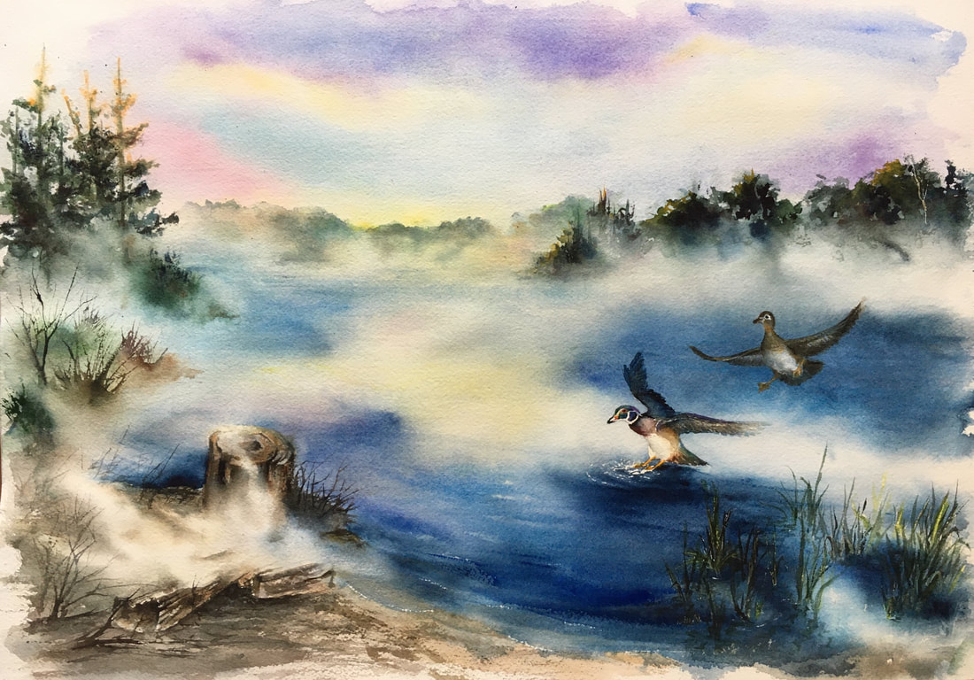
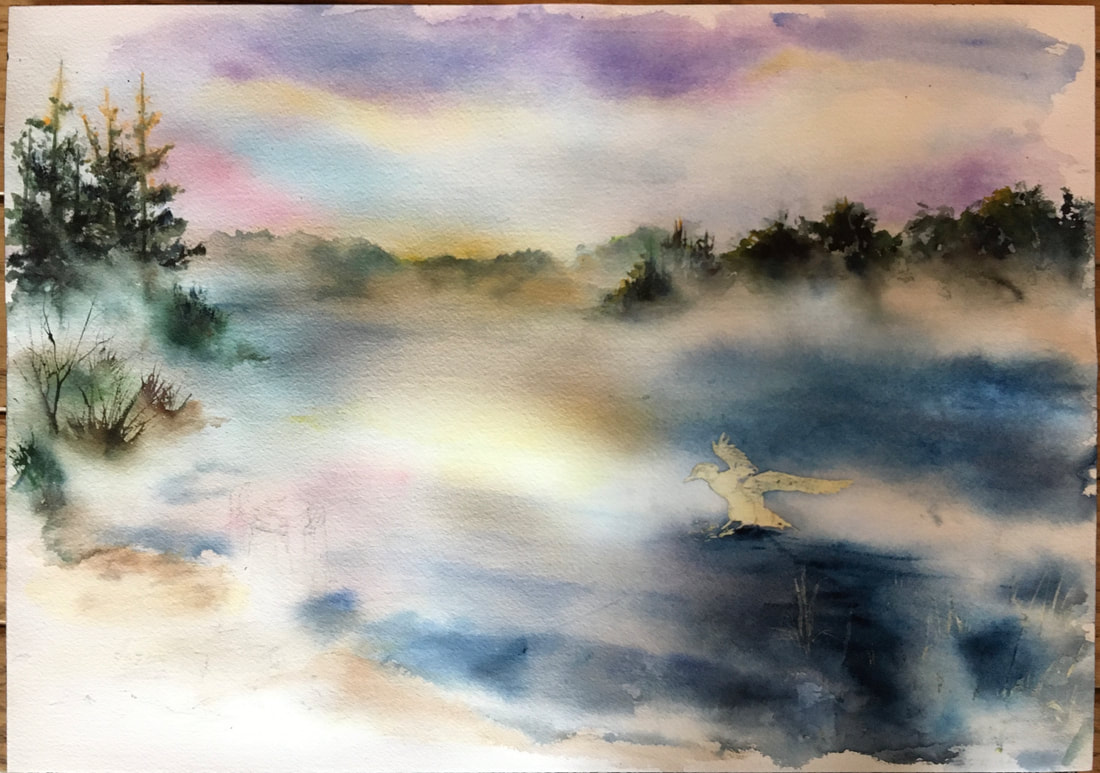
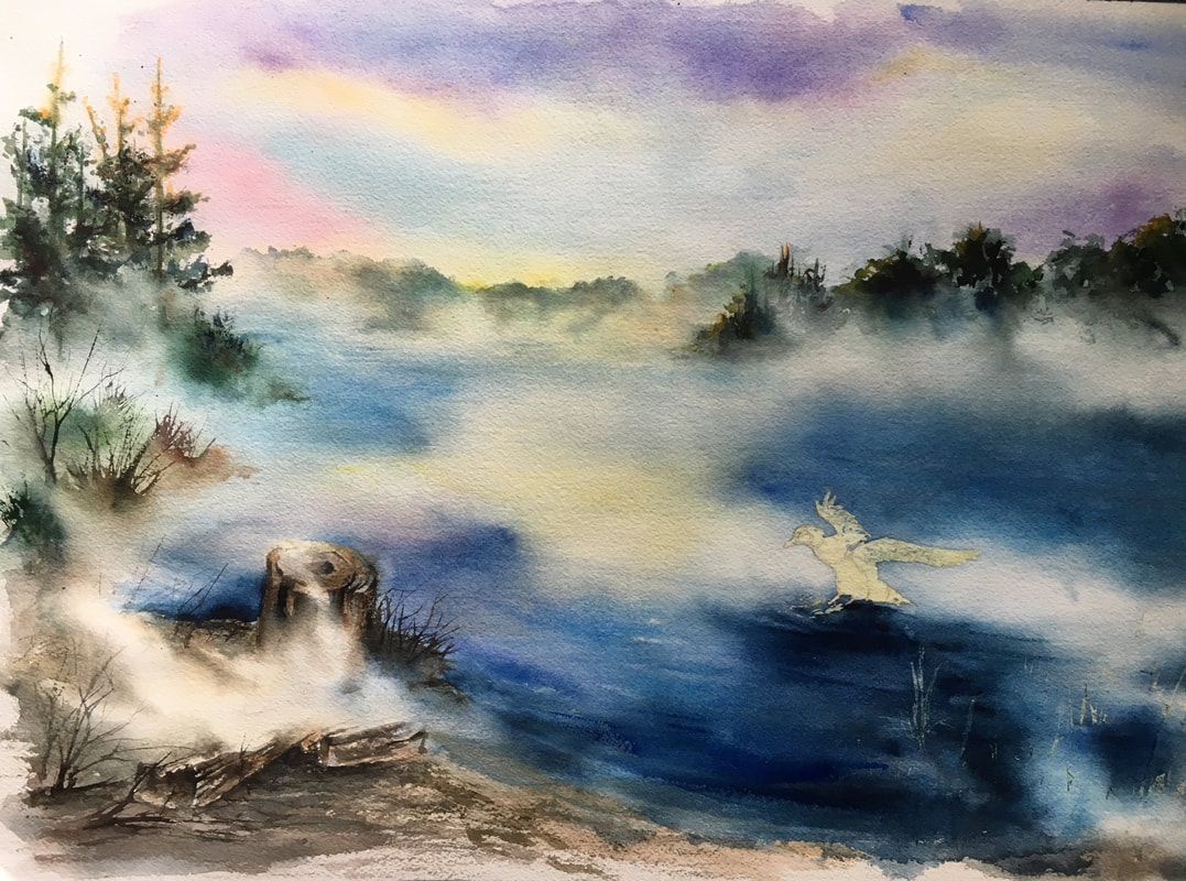
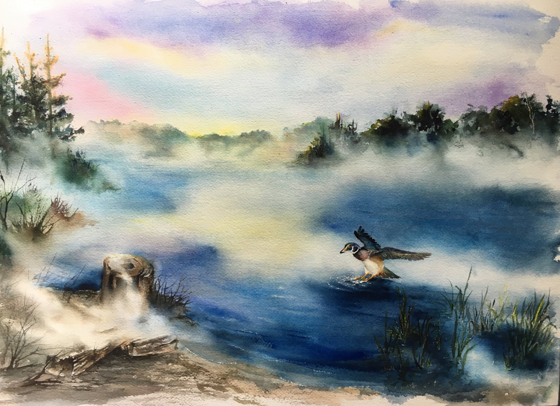
This was originally going to be a painting of Halfmoon Lake off the Potawatomi trail in the Pinckney rec. area in the fall.
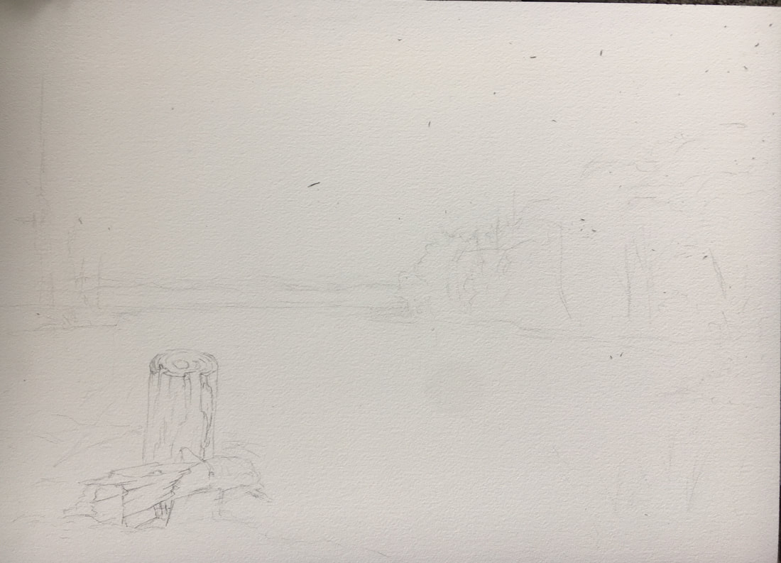
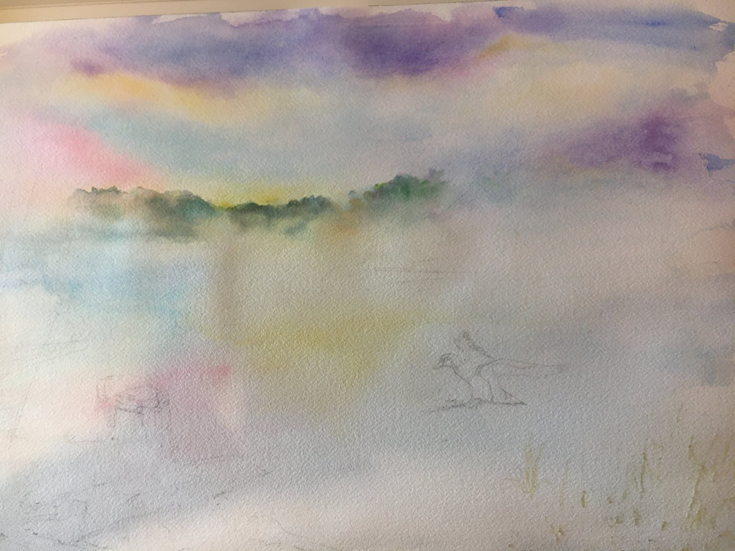
My intent was to highlight the stump in the bottom left, have a colorful sky and fall foliage in the tree line. This was started mid March right after schools were closed. I had added in some background washes of color then hit a brick wall as I stressed. Fortunately for me I got my mojo back and picked up the brush again.
My first washes had dried light and I was able to add more hues when altering the design in July. The decision was to use my basic design with mist on the lake, change the season to summer and add a wood duck.
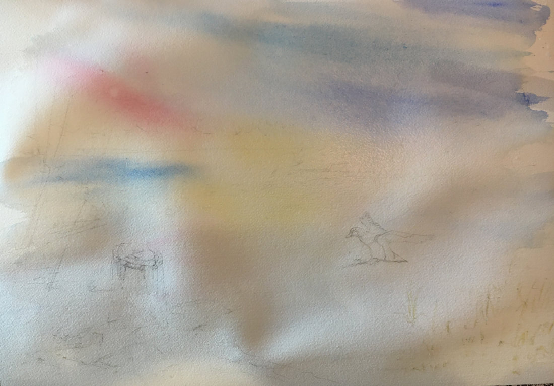
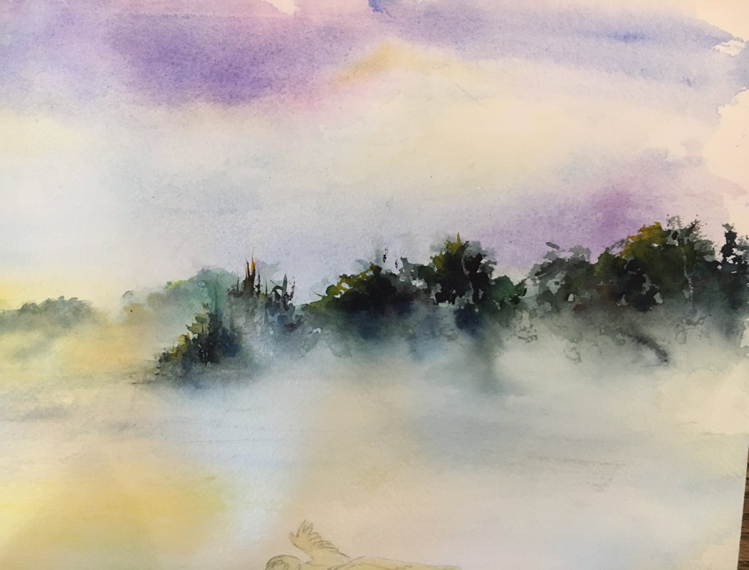
Below you can see I built up the hues in the background. It took a couple of tries, new washes over dry, to achieve what I wanted. Once I had the basic background I started on the furthest tree line with colors that I would use throughout the composition.
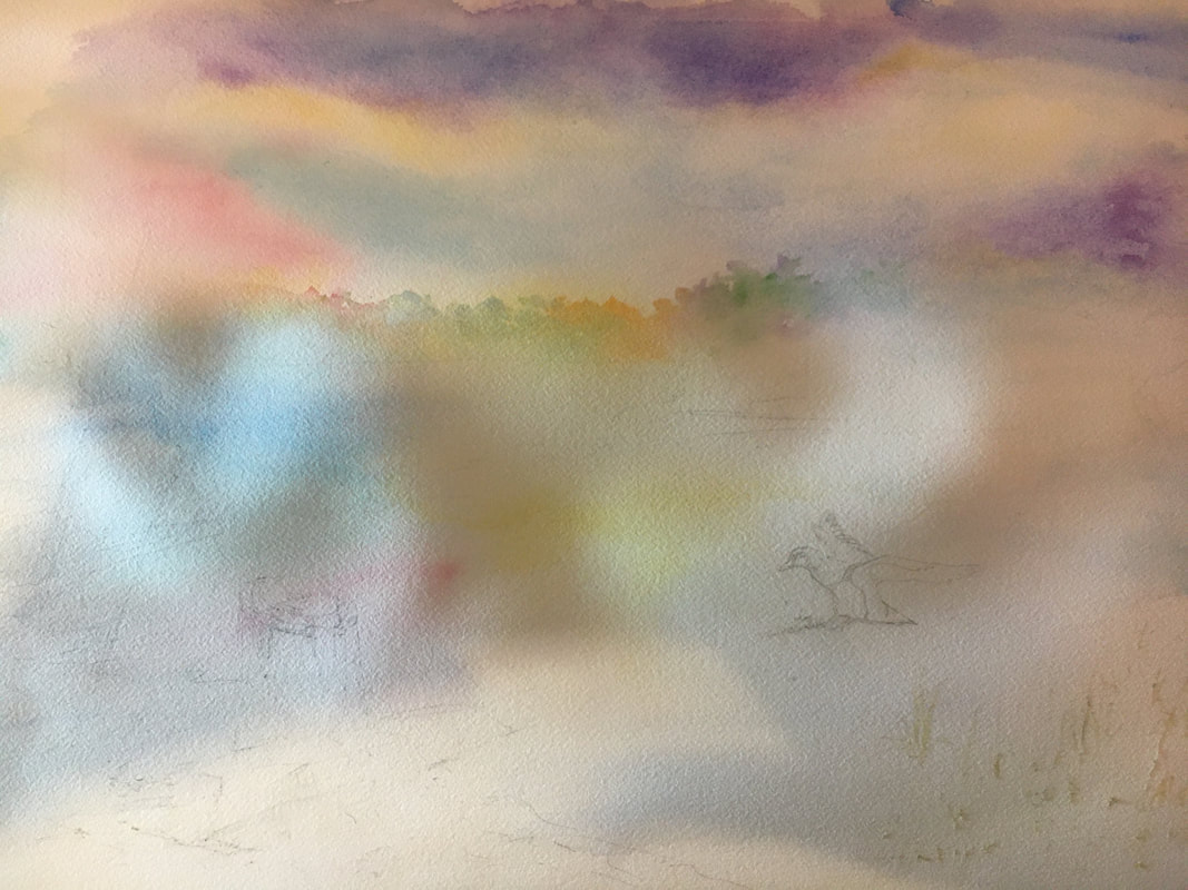
To add in some visual interest I started with the oranges, pinks, greens, and purples in a light wash, flowing them into water to create the mist effect. More greens for summer were added on top after the first wash had dried after re-dampening where I wanted the mist to be.
You can create the mist effect by using a brush that has a lot of paint and water in it and letting the paint crawl into areas that you have dampened with water. More water is attracted to areas of less water. After the horizon was dry I added in the beginning of the second tree-line and the trees in the mid-ground wetting beneath them to encourage the paint to crawl into the damp areas. A little tilting and rolling of the paper helped created the flowing mist tendrils.
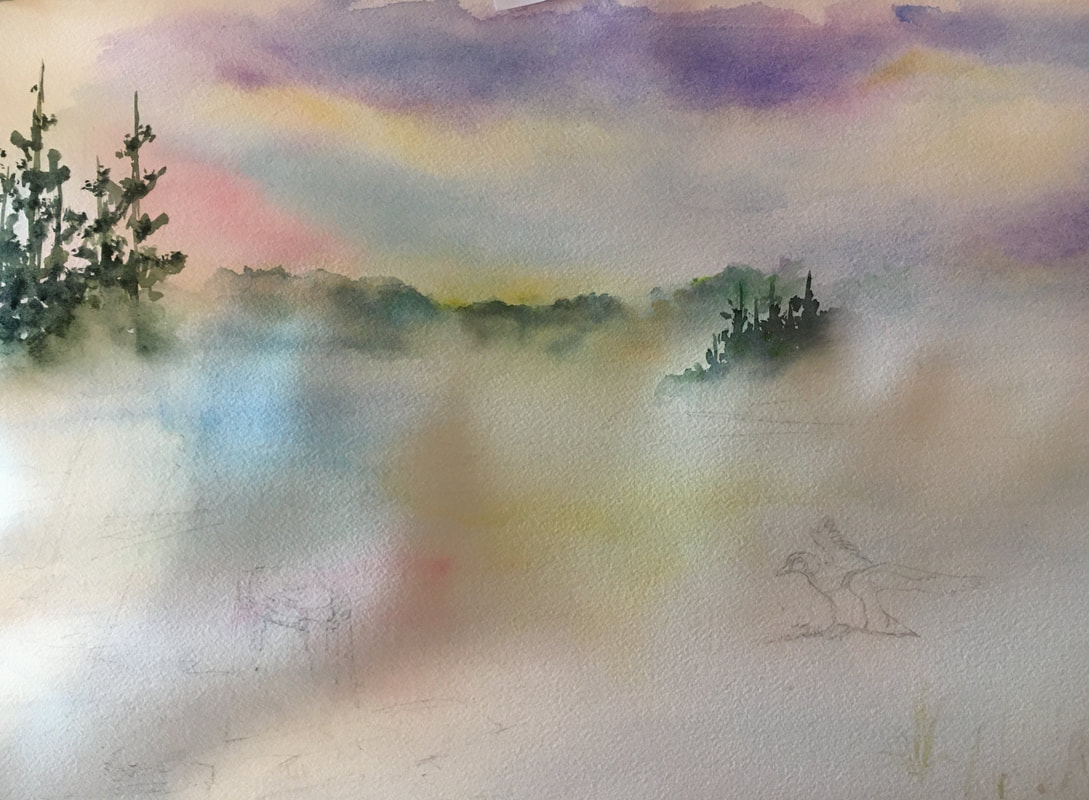
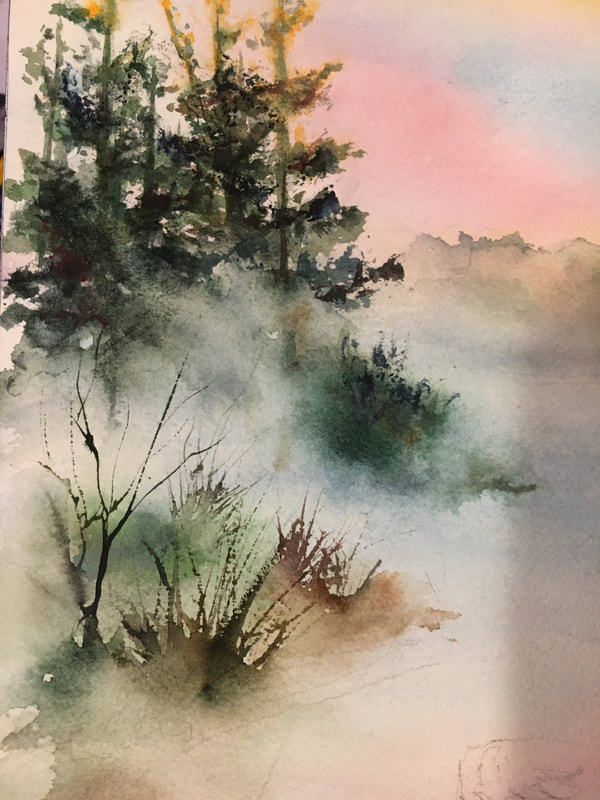
I added in more trees to the right and left, laying down some base hues while the paper was damp, then added a little yellow orange for the sun catching the tops of the trees on the left.
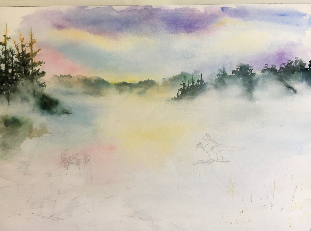
After that area had dried I used a rigger to add in the brush below and the branches/brush in the background in a lighter value adding clean water at the bottom to fade it into mist. A sponge was used on top after the paint dried to add texture and depth to the trees and bushes in the back.
The tree-line on the right also got some sponging to add a feeling of depth to the foliage and the duck was masked to preserve the white areas.
Turning my attention to the foreground, some base colors, Winsor brown and quinacridone gold were added in a light wash.
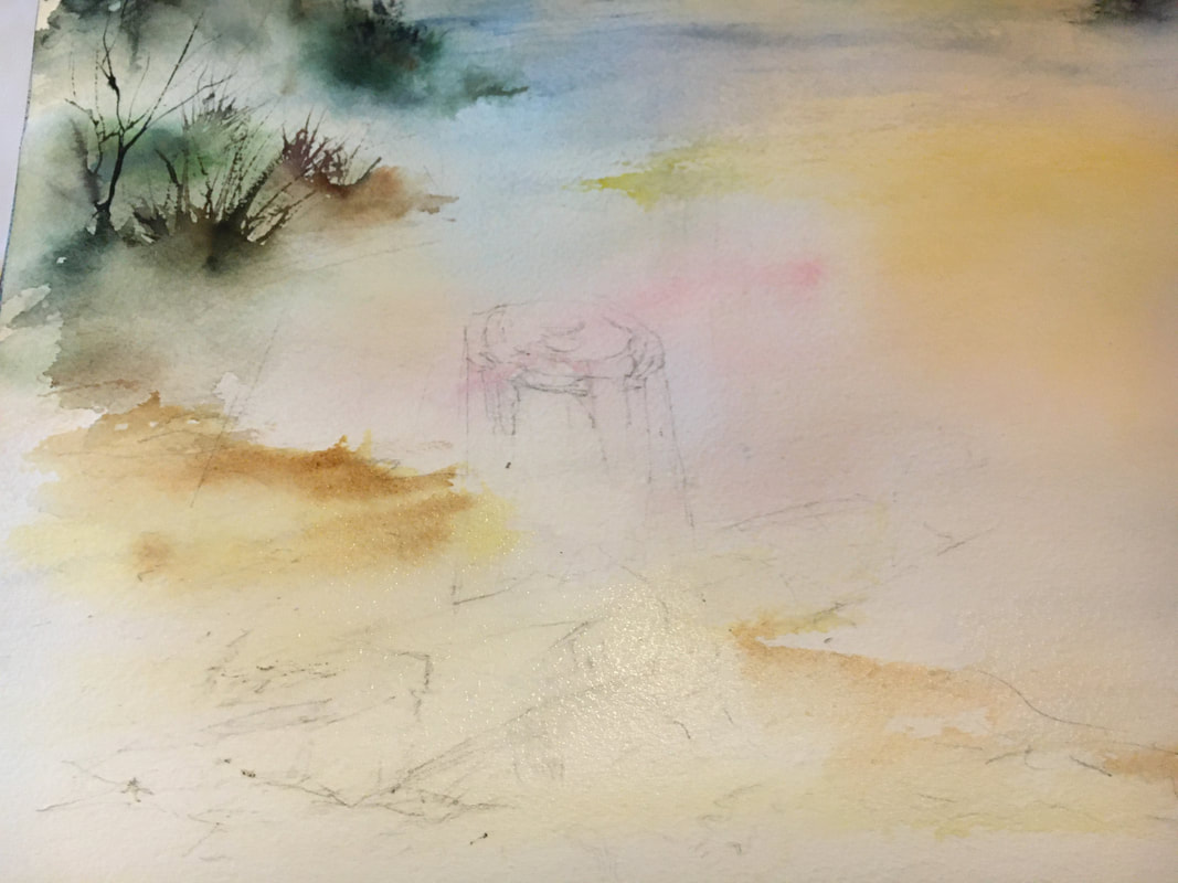
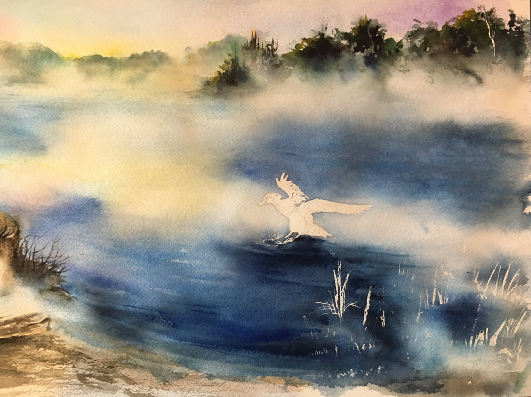
It occurred to me that if I wanted the mist to really show up on the water I would have to use deeper values/hues than I had originally planned. With that is mind I used Ultramarine Blue, Indigo, Indanthrene Blue, and a little Cobalt Blue to achieve the darker values. I flooded the area several times with water adding in more paint each time to darken my values and create the mist.
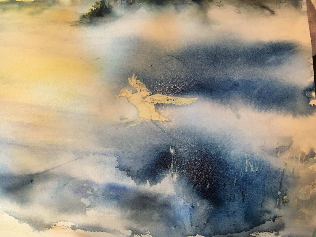
Darker areas were added under the duck along with bands of blue that paralleled the shoreline like waves coming in.
It took a couple of applications of the blues to achieve the depth of color I wanted as the watercolor lightens as it dries.
I made sure during this that the areas I wanted mist in were damp with clean water and I did not actively paint into them. The darker hues were added around the damp areas and the paper was tilted to encourage a flow of paint into the edges of the "white" areas. I spritzed a little clean water onto my paint to add subtle texture to those areas.
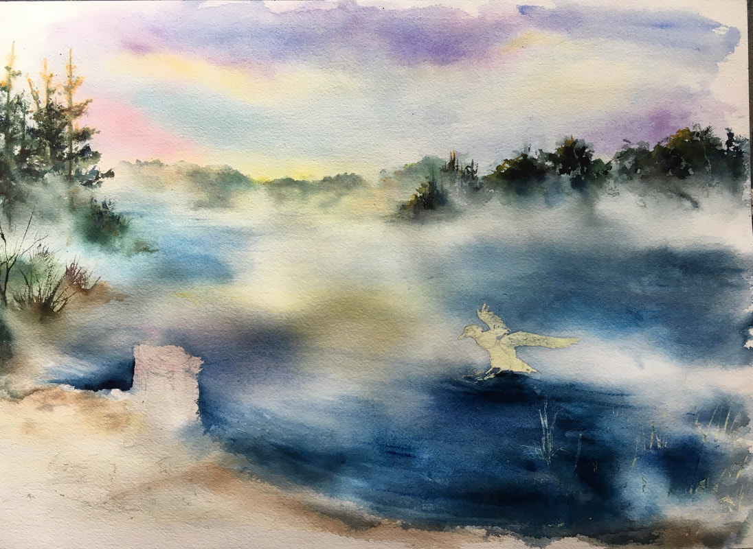
The "thirsty brush" technique, were a damp brush is dragged through wet painted so it acts like a sponge and picks up paint, was used to create the light edges of the waves as they approached the shoreline.
Re-thinking the design I decided the stump would compete with the duck if painted it as I originally intended. To alleviate that conflict I decided to add some mist over it. Some dry brushing in the foreground is the start to the shoreline texture.
More dry brushing with details on the stump and log are added in using Sepia, paynes grey, and a warm brown. Twigs and sticks are added with the rigger being careful to lighten the value as they go back into the composition.
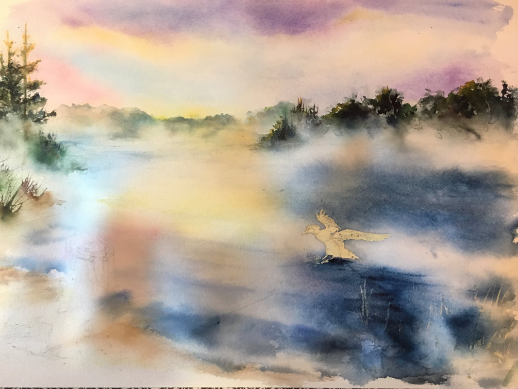
I removed my mask 😳 always a shock, found I had forgotten about the reed masking I originally thought I'd like and spent some time layering over the reeds to tone them down.
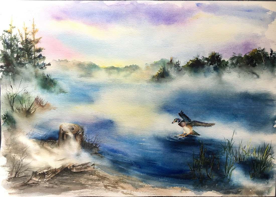
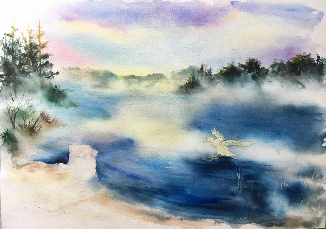
The wood duck was put in with a #2 pointed round brush, with Caput Mortuum Violet on the breast. Indigo, Paynes grey, Sepia, Transparent Umber were used on the wings and body. The head was a combination of Cadmium Red Deep, Green Gold, a touch of Helio Green, New Gamboge, and a purple made of Ultramarine Blue and Opera Rose. I used a toothpick I had flattened to but in the dark dot of the eye.
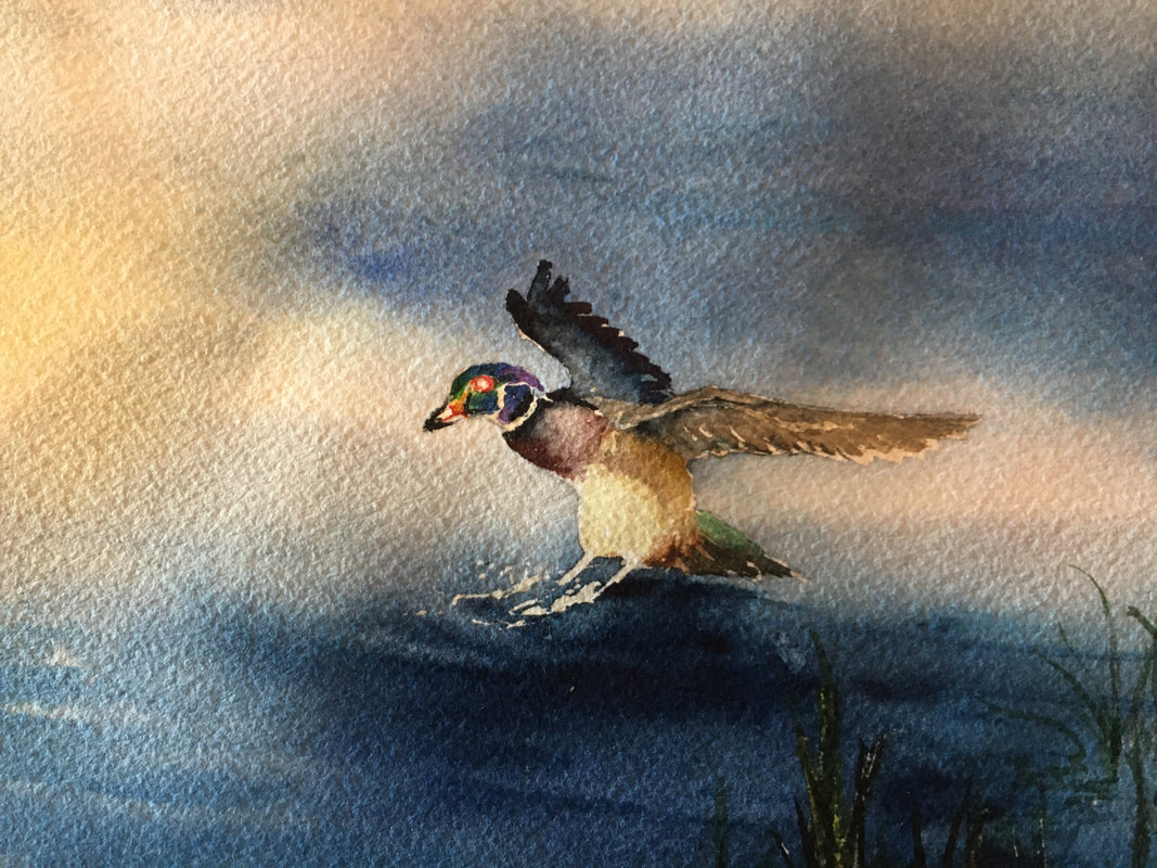
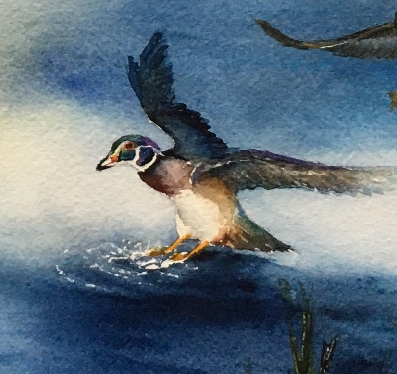
I had not preserved enough white paper for the splashes around the ducks feet or the waves rolling into the beach. To add more in I used a razor blade and carefully scratched the paper. Be sure you are not planning on adding more paint before you scratch your paper because the scratches will pick up the most pigment.
It was at this time that I decided I wanted just a little more on the right side to really draw your eye there. I was able to lift, using a stiff brush and clean water, enough blue paint to give myself a white spot for the female wood ducks body. The darker areas were added over the existing blue, the male wood ducks wing tip was lifted out a little and white paint was used to add the distinctive white area around the females eye.
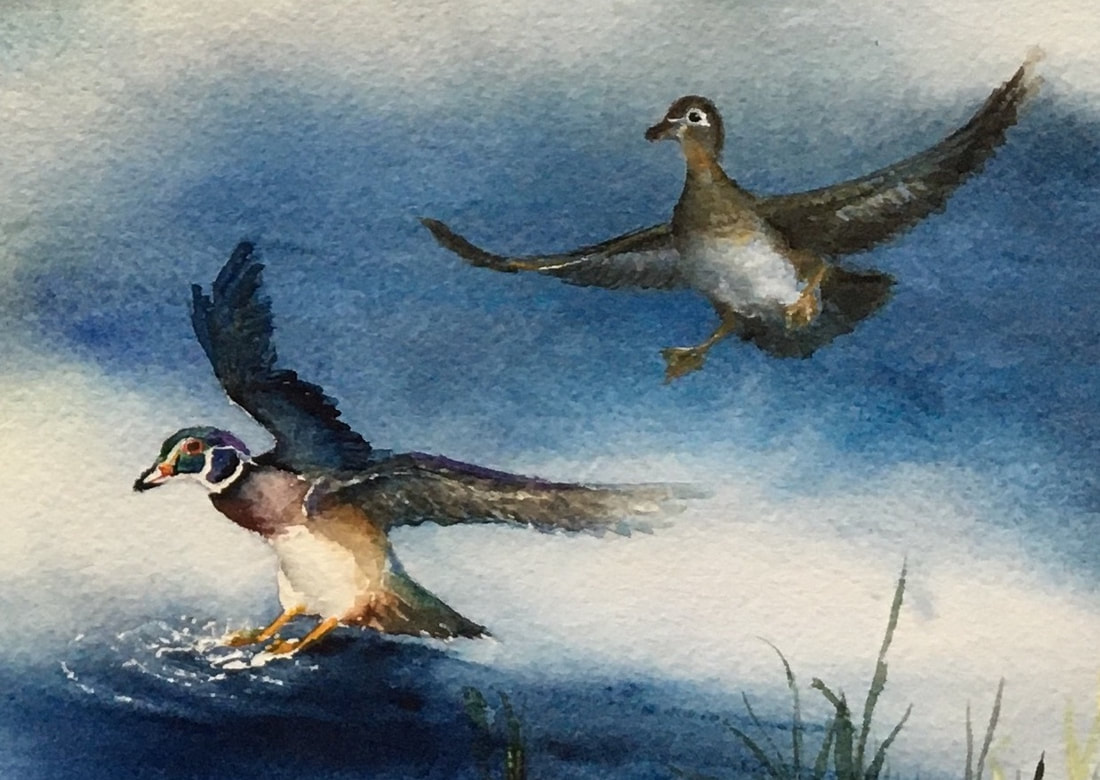
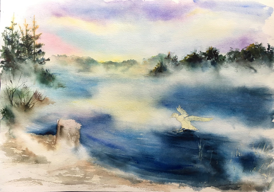
Overall I'm happy with it. I may have shifted things slightly to the left if I had started out originally thinking of putting in ducks, but I think it works.
 RSS Feed
