Backgrounds are tricky things, they really can be a deciding factor in whether a painting is just good, or whether it is more than good.
So should you have a background? To decide this, think about what a background is and what it can add to your painting;
1. It can give context to your main subject matter
2. Emphasis to your focal area
3. Offer contrast
4. Add color to the composition if desired or needed.
What you want to strive for is something that “complements” the picture, but does not compete with the subject matter/focal point. You want to unify the whole composition and enhance your picture, without making it too busy. A background should make the picture look better with it than without it.
Do you always need a background? I would say no. A simple white background will focus your attention on the subject matter, and is often used by illustrators. It can look elegant, or formal.
But what if you want your picture to look like more than an illustration, how do you go about making a background?
It can be as simple as adding in a shadow or wash behind your subject matter. You can "ground" your subject matter by adding in dirt or grass below it, focus attention by using a vignette type of background that leaves the edges of your paper white. You might use colored paper or a wash to set off your image as in a portrait. A wash with variations of hue or value in it, with value changes under your object can also “ground” an object like a shadow so it doesn’t appear to be “floating” in your composition.
Another advantages of a back ground is if you use your light source to emphasis an object or show it's form, it gives you the edge to show objects that are white.
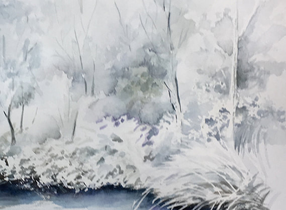
In the painting below, without the background you would never see the back edges of the foliage near the water.
So should you have a background? To decide this, think about what a background is and what it can add to your painting;
1. It can give context to your main subject matter
2. Emphasis to your focal area
3. Offer contrast
4. Add color to the composition if desired or needed.
What you want to strive for is something that “complements” the picture, but does not compete with the subject matter/focal point. You want to unify the whole composition and enhance your picture, without making it too busy. A background should make the picture look better with it than without it.
Do you always need a background? I would say no. A simple white background will focus your attention on the subject matter, and is often used by illustrators. It can look elegant, or formal.
But what if you want your picture to look like more than an illustration, how do you go about making a background?
It can be as simple as adding in a shadow or wash behind your subject matter. You can "ground" your subject matter by adding in dirt or grass below it, focus attention by using a vignette type of background that leaves the edges of your paper white. You might use colored paper or a wash to set off your image as in a portrait. A wash with variations of hue or value in it, with value changes under your object can also “ground” an object like a shadow so it doesn’t appear to be “floating” in your composition.
Another advantages of a back ground is if you use your light source to emphasis an object or show it's form, it gives you the edge to show objects that are white.
In the painting below, without the background you would never see the back edges of the foliage near the water.
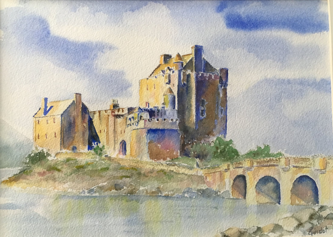
A back ground can also unify all the elements in your composition. You can do this by using a color in your background that picks up the colors used in the main elements of the composition. In the picture below the blue of the sky is also present in the shadowed areas and the water in the foreground.
What to watch out for...
Quite often even an experienced artist will have a background that doesn’t turn out as expected. Some common problems (but by no means the only ones) are;
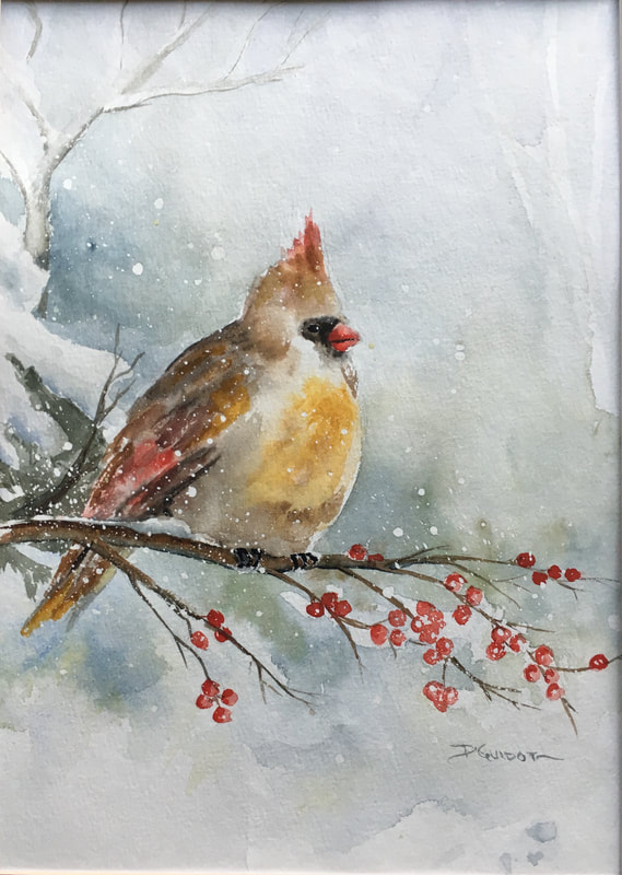
1. Too much detail in the background and it detracts from the composition. Simplify and remove unneeded objects The background around the cardinal is enough to give context, emphasize the bird but not overshadow it.
Quite often even an experienced artist will have a background that doesn’t turn out as expected. Some common problems (but by no means the only ones) are;
- It’s to strong and over-shadows the rest of the composition.
- It’s too busy and competes for attention with your focal point.
- There is a mistake and it draws your eye to it.
- You used the wrong color and it looks like it is from a different painting.
- You’ve outlined your objects with paint and they look cutout.
1. Too much detail in the background and it detracts from the composition. Simplify and remove unneeded objects The background around the cardinal is enough to give context, emphasize the bird but not overshadow it.
2. TMI !!
You kept too much of the background and it is competing with your focal area. Simplify simplify simplify. You don't need every leaf, tree, bush, car, etc to tell your story. Some things may need to go away. maybe there will be somethings you add.
3. Watch out for that area that is a mistake in your background. If you have one dark area or odd bloom, it will draw your eye

4. Using the wrong hue (color) so the background looks like it belongs to another painting.
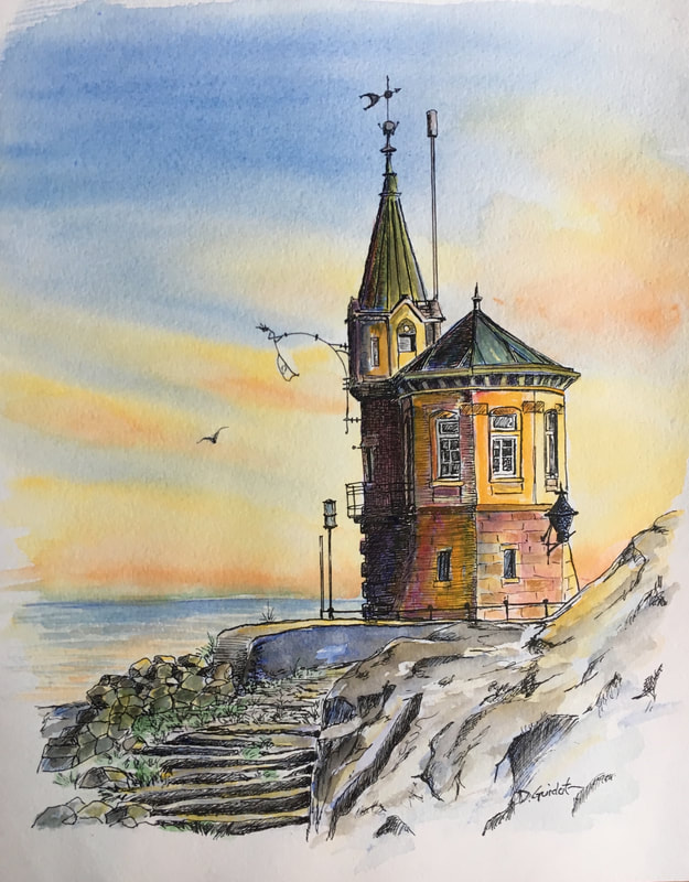
If the painting below had a totally blue sky, it would not tie together nearly as well as the sky with the orange in it. Orange picks up the colors in the foreground objects and ties together foreground and background while unifying the whole painting.
If the painting below had a totally blue sky, it would not tie together nearly as well as the sky with the orange in it. Orange picks up the colors in the foreground objects and ties together foreground and background while unifying the whole painting.
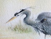
5. Outlining your objects. Remember you can leave open spaces or change values around an object and it will look more realistic, less “cutout”. Your eye will fill in any missing spaces as it does on the head of the huron.
6. Using the wrong color. If you’ve used the wrong color or think you need a darker hue or value, let your paint dry thoroughly and paint over it. If you’ve decided you’ve gone too dark and need to lighten up, if your paper is still wet quickly blot with a good quality paper towel. If the paper is dry and you have used a good quality watercolor paper you should be able to re-wet the paper and “lift” quite a lot. Remember not to work the damp paper too much when lifting, it is better to lift a little let it dry and try again than to scrub when your paper is wet. That will likely leave you with a damaged surface.
7. Bleeding your colors together. If that is the intent, it is fine but if you’ve had two colors run into each other unintentionally and mix into a muddy color you can quickly use a large damp brush as a sponge to lift off the offending mix. This will leave the two original colors still there and you can add a small amount of water between them to soften any edges. Remember to let colors that may create brown just “kiss” each other rather than mix together.
8. Unintentional smears or drips may be a problem or may not. It depends upon how you view some of the more spontaneous aspects of watercolor. If they bother you they can generally be fixed if you are using a good quality paper. If spots/smears have dried, use clean water and a stiff brush to “scrub” out the unwanted color than blot with a good quality paper towel.
9. Another thing that can bother artists is uneven washes.
Uneven washes are a problem that can be caused by many things. Your paper partly dries or it has gotten over wet and water pools in spots. You touched an area and picked up some pigment or your paint was too thick and did not spread evenly. Washes are a tricky technique to master. It's the kind of thing we all practice over and over to get right. It’s not unusual to get a streaked appearance when laying a watercolor wash. Streaks occur because the paint has had time to start drying, you have not enough paint on your brush or pre-mixed and you are adding more in. Here are some tips on how to avoid streaky watercolor washes:
a) Be sure to mix up a generous quantity of paint for your wash. Running out of paint during
a wash is bound to create problems. A smooth wash requires uninterrupted brush strokes. You can't stop in the middle of the process.
b) Make sure your brush is well loaded with paint and try tilting the paper so it forms a “bead” of paint and water at the base of your brush stroke. Use the bead to push paint down the paper with each alternate brush stroke. Continue to load your brush so that
there's always a bead to chase downward.
c) Use a brush that is big enough for the surface you’re painting. Don’t use the #4 or #5 you might use on the rest of the painting, grab your 1” flat brush so there are less strokes.
d) Don’t have the paint so thick it is sticky and leave streaks.
e) Watch for unwanted blooms. These happen when you have a dryer area next to an area that you have introduced wet paint and/or water into. The damp area draws paint from the wetter areas and caused the feathery bloom patterns you see.
f) And speaking of water, remember if you add wet paint or water to a dryer area you will very likely to end up with "dry lines" between the two. I have had success taking the "wet" paint or water and feathering it over my dry areas, spreading it out over the tops of the "tooth" of the paper to diffusing the water and foil a dry line.
10) Over working can ruin a background. Continuously reworking an area of a painting produces overworking. The resultant is paint that can look dull and lifeless. When you brush the surface of watercolor paper time after time this loosens the paper fibers which can produce a fuzzy surface and that allow the pigments to go deeper into the paper. The result is dull colors. The solution is to work quickly. When you paint try to use fast and confident strokes and be sure to let washes dry if you are planning on multiple glazes.
 RSS Feed
