A student in one of my classes had expressed a lack of enthusiasm regarding the rendition of part of their watercolor and asked me what I thought.
Well, you ask me one simple question and it's going to involve me asking you half a dozen more. “What do you want to show? Are you going for a mood, are you showing the viewer something you consider beautiful, what is the intent of the piece? Do you have something that is a "focal point"? What colors are you comfortable with? (if you've seen my paintings I tend toward every color everywhere) Have you considered going "High Key", Low Key or using a full value range in your hues? Why did you choose the reference you're using? What do you like about it, specifically”.
Quite often what I find missing is the contrast that is in the reference photo, and that lack of contrast is what makes the feeling of "not right".
Below is a value scale of black showing different "key" palettes and some examples of paintings done in them.


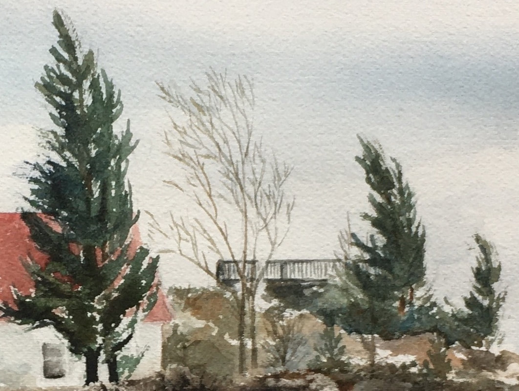
Value is the lightness or darkness of a hue and can affect the “effect” of your work on others. Take a look at Arthur Streetons, "At Templestowe", 1889, and Claude Monet'sThe Entrance To Giverny Under The Snow, 1885. Combined with the subject matter, the “high key” palette gives a peaceful easy feeling. High Key Palettes run from the light value to a mid-range value.

Claude Monet, The Entrance To Giverny Under The Snow, 1885
Monet's "Seascape" on the other hand has a brooding feeing with the "Low Key" palette which runs from the darkest value to the mid-range values.
 |

Childe Hassam, Nocturne, Railway Crossing, Chicago, 1892-1893, Low Key painting creates a dramatic feeling and is also a great way to show the illusion of lights.
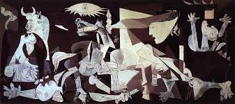
Variety is indeed the spice of life, and contrast is one way to achieve it. I'm not saying using contrast is for everyone but if you find yourself unhappy with something consider extending your value range and see if the greater contrast gives the feeling you want to portray.
There are many ways to create contrast of course. You can use color, texture, line, value, shape etc., but one of the easiest, I think, is by varying the values of the hues you are using.
There are many ways to create contrast of course. You can use color, texture, line, value, shape etc., but one of the easiest, I think, is by varying the values of the hues you are using.


 RSS Feed
